Susan Ashbrook - artist and teacher
  • Home
  • About
  • Gallery
  • Fall Programs
    • PROGRAM INFORMATION
  • Testimonials
  • Ashbrook Creative Products
  • Blog
  • Contact

Click Here for the Full Experience!

5/27/2015

6 Comments

 
This blogging thing is an ongoing learning process for me. Catherine Wray Gutsche, my amazing web designer (Calico Communications: http://www.calico-com.com/), sent me an email the other day, in which she suggested that I tell my readers to click on the title when they receive my blog notice. This takes you to the website, where you can read it, subscribe and also, more importantly, leave comments.

I'm counting on your comments to help me move the blog in the direction that works best for both you and me. I want to hear what you would like me to write about, comment on, and also submit your own experiences that relate to my topics.  Send me photos of your work because I'd just love to see it. Let me know if my painting tips have been helpful. As I said before, this blog is not so much about me, but about what you want to learn.

On another note, my sister Valerie, who with her husband Sab, owns The Cuckoo's Nest,  (http://www.thecuckoosnest.ca/) in Westboro Village, in Ottawa's west end, has commissioned me to do a pen and ink sketch of the old Westboro Town Hall. She plans to have it printed on the popular stone coasters that she carries in the store. I'm looking forward to it! It will be a fun change of routine!

Today's Painting Tip: A request by Marilyn
Painting rain and rainy windows

Painting rain is a bit like painting glass. It's there and it's real, but it is clear, transparent and messes with the light. As such, since you won't be painting every raindrop, try setting the stage with a rainy mood. Use more neutralized, subdued colours to transmit the grayness of the day. Use lots of reflections on the ground and horizontal surfaces to indicate the build up of rain water.  Think about things like where would water overflow an eves trough or junction of roof planes, to show how much it is raining, and then create your painting.

Once you have your painting pretty much done it is time to add your rain. Start with a round brush and load it with white, toned down with some gray and start applying short, light strokes, quickly, in the direction the rain is falling. The strokes should all be in the same direction. You don't need to apply large quantities of these strokes of rain, but rather suggest it and let the viewer's brain fill in the rest. Those in my classes get used to me telling them that less is more, and if you do too much it becomes artificial looking. Don't forget to put some splashes of white where the raindrops hit the water on the ground, or even little wave rings where the drop hits. Again, here and there rather than for every drop. Less is more!

If you are painting a landscape and the rain is off in the distance, as one often sees in Prairie landscapes, dry brush white or pale gray in the direction of the rain.

When gazing out over a landscape, through a rained-on window, the view through the window will be somewhat distorted by the rain. The landscape will not be a sharp as if the window was dry, so soften the edges of your landscape to create that kind of misty feeling. Again, cooler, grayer colours will help create the mood.

Once you are ready to paint the rain drops running down the window, treat them as  you would clear glass or water droplets. Don't paint the rain, paint the shadows and highlights. In some areas the background will show through and in some cases there will be white highlights and deeper gray shadows.  Again, more is less as you don't want to completely obstruct your background with rain drops.

If you haven't painted rain before, I suggest working from photographs to get the hang of it... so that you can paint what you see rather than what you know. What you see always works better than what you know. Trust me!

Update on the Painting of Jane's Photograph:
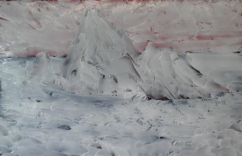
Well the coat of gel medium to create the texture is dry. It takes about 24 hours in good weather, longer in wet/humid weather and less time in hot/dry weather.

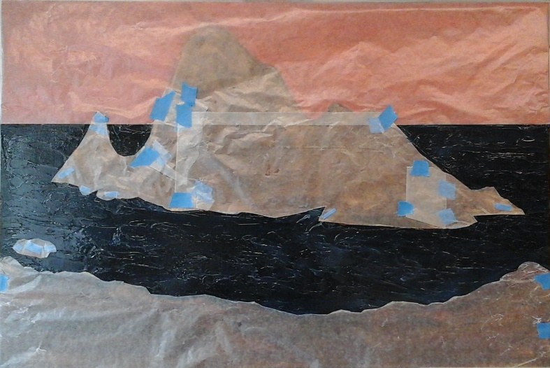
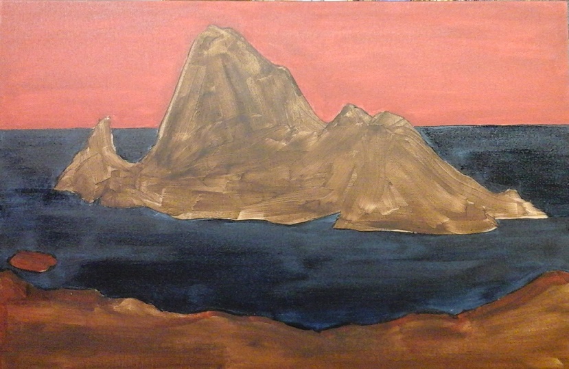
My next step (photo 1) is to mask all parts of the painting that I will not be applying gold leaf to. For this I use waxed paper and masking tape. Then I use an aerosol leaf adhesive, according to the product instructions, applying it using horizontal strokes and then vertical strokes to make sure all areas are properly covered. I then remove the masking and discard it. Drying time is usually about two minutes until it becomes tacky enough to adhere the leaf.

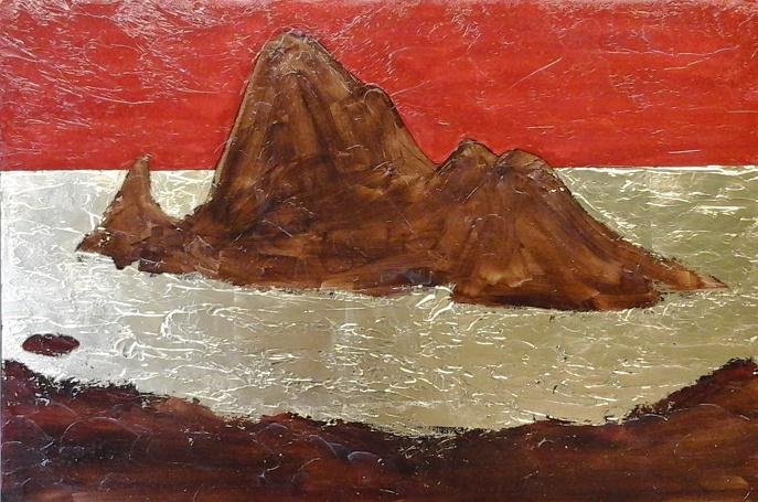
Applying leaf is quite easy as long as you take your time and follow this simple procedure. I prefer to use the leaf that is unbacked (rather than "simple" leaf that comes with a backing paper) that can be lifted easily by placing a piece of wax paper over it and pressing your hands over the wax paper. I'm not sure if it the warmth of your hand that softens the wax to hold the leaf, or if it's static electricity that causes this. Once the leaf clings to the wax paper you can easily lift it, position it and then press it against the tacky surface. Press down on the waxed paper to get full coverage on the painting and then lift it away gently. Using a paint brush gently brush it into the cracks and crevasses. You can use a stiff paintbrush to remove any leaf that is not glued down. Sometimes, if it is very warm weather you may find the leaf sticking to non-glued areas. This is easily removed by pressing masking tape to the leaf and lifting it off the painting. See the applied leaf in photo 2.

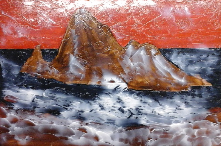
Okay, so to date we have blocked in the image in colour, added gel medium to create texture, masked and sprayed leaf adhesive and applied the gold leaf. What's next? Tune in next week to find out!

Best wishes,
Susan

6 Comments

Cars, Effective Backgrounds and Painting Update

5/20/2015

0 Comments

 
Today I picked up my new car. The salesman asked me if I was excited to be getting a new car. I never really thought about it. Is one supposed to be excited when picking up a new car? It depreciates the minute you drive it off the lot, you have to insure it, feed it, make sure it gets regular check-ups and bathe it. But, I suppose if it's your "baby" that's not a lot to ask.

For me a car is merely a means of transporting me, my paintings, my art supplies and groceries. It's a balance between the expense and the cargo space... and that "New Car" smell that is raved about... I find it particularly suggestive of the petroleum distillates used in the plastic and carpeting! 

Anyway, it is a nice colour... a warm gray (something an artist would appreciate), and it does have heated seats, which I'm hoping will make up, in some way, for the remote start that it doesn't have, and I can still fit my paintings and art supplies in it! Really, what more could an artist ask for? Okay, well, a cube van, maybe?

Today's painting tip: Effective Backgrounds
The colours you use for your backgrounds in your painting will have a dramatic effect on how your painting turns out.

For example, if you are painting a landscape, because cooler colours (those with a blue or green bias) will appear to drop back and therefore create greater depth in the painting. In landscape it is always suggested that you use your warmer colours (those with an orange or red bias) in the foreground to make it come forward, which also increases the illusion of depth in a flat, two dimensional work of art.

When painting still life, florals or anything else where the background colour is yours to choose, think about the colours you are going to use in your subject matter. If your subject matter is predominantly warm colours then a cool coloured background will help to emphasize the warm colours and push them forward. If on the other hand, your subject matter is predominantly cool colours then a warm background will push them forward.

Alternately, say you were painting a pumpkin still life, you could use a complimentary colour to make your pumpkins stand out. I suggest mixing the orange colour of your pumpkins with it's compliment, blue, to create a more neutral gray background which will make your pumpkins pop! Your neutral could easily lean more to the blue to help push your pumpkins forward. You can do this with any of the complimentary pairs... violet and yellow; red and green; and of course, blue and orange.

Not sure about what colour to paint your background? A pretty reliable trick is to mix the colours in your subject matter to create a fairly neutral mix, perhaps with a leaning to the compliment of your predominant colours in the main subject.

An easy background to create is what I call a mottled background. One that I like to use suggests leaves and sunlight as a background to flowers or close-up leaves. I start with a variety of greens and my yellow-green (Hansa Yellow Lt), after determining where my focal point will be. That is where I use the most yellow to create a bright back light to my subject matter. Then I just apply the greens and yellow, using overlapping "X" strokes, with colour applied quite randomly, except where dark and light enhances the composition.

For those who are experiencing a artist's block, doing a series of quick paint sketches of various warm and cool combinations of backgrounds and foregrounds can get you all fired up again. I suggest doing them small, on 5" x 7" canvas boards or paper. Keep them as they make a great resource to refer to in the future.

From my paint box the warm colours would be:
Cadmium Red, Medium or Light - Orange bias
Ultramarine Blue - Red bias
Cadmium Yellow Medium or Light - Orange bias
Sap Green Light (Lightfast) - Yellow bias (if you use tube greens)

The cool colours would be:
Quinacridone Violet - Blue bias
Cerulean or Phthalo Blue - Green bias
Hansa Yellow Light - Green bias
Viridian Green - Blue bias (if you use tube greens)
Phthalo Green - Blue bias


Update on the Painting of Jane's Photograph:
Here is the second stage with the gloss gel medium applied to give the painting texture. The gel medium is applied evenly across the whole painting with a large spatula and then, as you can see in the first photo, the texture is created to mimic the various features of the painting image underneath. The medium will dry clear, as you can see starting to happen in the second photo, and then... well you will have to wait until next week's post to find out about that!

À la prochaine!
 Best wishes,
 Susan

0 Comments

Green Springs Eternal!

5/14/2015

0 Comments

 
Driving around town these last few days has stirred my incredible appreciation of spring greens. You know, the delicate yet varied greens of trees and bushes as the tender young leaves burst from buds to bask in the warming, nurturing sunlight. They appear like semi-transparent mists floating around the branches. Look at them carefully with your artist's eyes and you will see pale yellow greens, with hints of red, pink, purple and brown. And, for a beautiful colour accent there are also the elegant whites and profuse pinks of fruit trees and flowering bushes.

Truly an artist's paradise for a painting challenge! Sadly these magical mists don't last long as they become darker and more solid in colour as the leaves grow. So if you want to capture the magic you need to get it done when it happens... make hay when the sun shines! 

In watercolour you can use a wet-in-wet technique that creates those green mists very effectively. Don't forget that watercolour lightens when it dries as the white of the paper becomes more prominent as the paint is absorbed into it, so you will want to start with enough paint to make the colour stronger than you want the finished colour to be.

To create wet-in-wet tree mists, start by mixing your various greens that you want to use, adding water to create puddles of colour. Then dampen your paper by applying clear water with a wide wash brush. Make sure that your paper is well soaked and then shake off any excess water. Next apply the colour from pre-mixed puddles, using a round brush. If  you apply the paint in the middle of the cluster of leaves it will spread, creating a softer edge at the outside of the cluster. Repeat until you have all of your trees in place. Once that is dry you can go back and suggest the tree trunks and branches, and complete the scene with rocks or roads or other features that you wish to use.

If you are working in oils or acrylics you can paint your scene and tree trunks and branches, then, once everything is dry, apply spring's green mist by using a glazing technique.

To create the glazes, mix the greens you want to use and then thin them with liquid medium until they are transparent. Apply with a brush to the areas you want. You can soften the edges by mopping up some of the colour with a damp paper towel. If the colour needs intensifying you can add more layers of glaze, once the previous one is dry. 

When painting with acrylics you can purchase a glazing medium or you can use liquid polymer medium. Both work equally well and I prefer to thin both with 25% water, which I find makes them both more workable. 

For oils you can use products like Liquin for glazing, or mix your own with 1 part Copal and 4 parts odourless solvent. 


By the way, if you do a spring green painting I'd love it if you send me a photo of it! Seeing what other people paint always inspires me! 

Speaking of inspiration, I recently started a new painting, from a photo loaned to me by one of my students. Jane had been working on this painting in class for a number of weeks and when she finished it, just last week, it was phenomenal! She captured the late daylight, from a cloudy sky, on the water. I was so taken with the image that she offered it to me for my own work. Thank you Jane!

My style is totally different from Jane's and I don't foresee much resemblance between our two works, but that is something that has always fascinated me... how each artist views, and produces the same subject differently from others. Just think how boring it would be if we all liked only the same thing, only the same way.


Today's Painting Tip: Mixing Greens 

Most artists that I know do keep tubes of green paint in their paint box, but it's not actually necessary, because you can mix a whole range of greens from a quite limited palette of colours. In fact, quite often the green you really need has to be mixed from some version of a blue and yellow mixture. 

If you subscribe to the split primary system of colour mixing, developed by Michael Wilcox, you will have two blues and two yellows in your paint box. The blues would include a violet blue (ultramarine) and a green blue (cerulean or phthalo). Yellows would be an orange yellow (cadmium) and a green yellow (lemon, hansa light or arylide light).  

To mix a brilliant green you would mix your green yellow and your green blue, because the more green that is present in the colour the more green your result will be. 

To mix a grayed neutral green, suitable for shadows or background you would mix the blue and yellow with the least green present, so the violet blue (ultramarine) and the orange yellow (cadmium). 

That leaves the midrange greens where you mix a green yellow (lemon, hansa, arylide) with a violet blue (ultramarine), or an orange yellow (cadmium) with a green blue (cerulean or phthalo). 

If you subscribe to a different colour pallette then you might be mixing Payne's gray as a blue, with yellow ochre, raw sienna or raw umber as yellows. 

Whatever your palette, it's an easy exercise to lay out all of your green options by creating a grid of combinations. Put all of your blues on one axis and all of your yellows on the other axis. Where the colours intersect, put the mixture that you attain from mixing the two colours.  

When lightening greens, use your green yellow (lemon, hansa, arylide) rather than white. Titanium white makes greens look chalky and artificial.  

If you prefer to keep tubes of green paint in your paint box then you need a yellow green and a blue green to be able to create depth and great paintings. Viridian green is a good blue green and my personal favourite is sap green light for the yellow green, just be sure it's a lightfast version.  

Thanks and best wishes,
Susan

Here is stage one of my interpretation of Jane's photograph.
Picture
0 Comments

April 30th, 2015

5/2/2015

2 Comments

 
Today I had the luxury of time off to spend with some old friends from the area arts community. Our times at Arteast had all overlapped and all had been President or on the Executive Committee at one time or another.

We talked about those members who had moved away, wondering where they are now, and we talked about those members who have passed away, remembering their contributions and endearing qualities. Lots of pleasant and funny memories all round.

Ahh, the "Good Old Days" when we did art shows based on themes such as "But, Is It Art?" and "What I Did On My Summer Vacation". We had a lot of fun poking fun at ourselves as artists and stretching the bounds of our art at the same time. Not to mention having to walk five uphill miles in the snow to get to meetings and then another five miles, uphill, in the snow to get home! (Sorry, I just couldn't resist that! It's truly an old-timer's thing.)

Arteast has continued to grow and develop over the 25 years of it's existence, and has become one of the most active art groups in Eastern Ontario. Arteast offers a wide range of exhibition opportunities in a variety of venues, including libraries, recreation facilities, restaurants and other surprising locations. Each month they have a general meeting for members and guests with excellent speakers on a variety of interests, from painting technique demonstrations, critique nights where members can get constructive suggestions on pieces they are having trouble with, business of art information (marketing, photographing artwork etc), and much more. Arteast also offers workshops with guest instructors and tours to events, museums and exhibitions of interest to members.

This is an excellent organization to join if you want to get your art out there and learn a lot of good stuff along the way. They are very supportive of their members and offer an inclusive and democratic learning opportunity. Check out their website at www.ArteastOttawa.com. I think you will be pleasantly surprised!

By the way, if you are a former Arteast member, I'd love to hear from you! Let me know what you are up to these days.

Something else that might be of interest to you is coming up on the October 31-November 1 weekend this year, in Ottawa. The very first "ART + SCHOOL + FAIR is Eastern Canada's first & only Art Material Trade Show. We bring together the best names and brands in the industry. See and try all of the latest tools and products on the market and walk away with a few samples! An opportunity for ages 10 and up to learn, explore, try and best of all… SHOP direct from the manufacturers themselves.  We've invited well known instructors and professionals to share their tips, teach classes and demo exciting and innovative techniques. Whether you are a professional, or just starting out you'll leave inspired."  You can get more information at www.artschoolfair.com.

The number of students at the senior's residence class just about doubled this week. Apparently we are having way too much fun and others want to get in on it. Perfect! While there are many skill levels and abilities involved, the one thing I want everyone to do is have fun and feel good about the art that they produce. I think I've been able to facilitate that.

I also wanted to mention a few workshops that I am offering this spring, in case there is something that you are interested in. These workshops will be held at St Columba Church, 24 Sandridge Road, (Manor Park) Ottawa,

Information and Registration: 613-833-8312 or ashbrookcreative@gmail.com

COLOUR HARMONY AND CONTRAST WORKSHOP
Going beyond colour mixing, this workshop delves into selecting colours that work together creating harmonious effects which will take your work to it's next level. You will learn about desaturating colours, selecting background colours, how to select related colours and having taken this workshop you will have a much better understanding of how the impressionists used colour to their advantage. We will do a number of exercises and then students will work on a painting of their own in the medium of their choice.
Saturday, May 23, 2015
9:30 AM to 3:30 PM
Fee: $115 (Includes extensive workbook and exercise sheets, students will need their own materials.)

DEVELOPING AN ARTISTIC JOURNAL WORKSHOP
Journals can be anything we want them to be... a record of a holiday; the story of your life or of a loved one; a study of a particular subject or theme; or a place where you polish your creative side, among other things. This workshop explores exciting techniques and materials that will start your journey of journalling, opening a window into your world. It will enhance your thinking process and your outlook on life!
Saturday, June 20, 2015
9:30 AM to 12:00 PM
Fee: $50 (Materials list at registration)

SILK SCARF WORKSHOP
Scarves are an accessory that enhances your outfit by adding a finishing touch and they are back in style this year! In this workshop you will learn how to create amazing scarves in the colours you want, to go with your outfits, or as gifts. Each participant will create two scarves. Additional scarves are available for $5, or $15 each for infinity scarves, for those who wish to do more. All materials are supplied for this workshop, and you will be amazed with what you create!
Saturday, June 20, 2015
1:00 to 3:30 PM
Fee: $65 (All materials supplied)

Please let me know if there are workshops on subjects that you would like to attend. I can set up workshops with visiting instructors if there is enough interest.

Today's painting tip: a request from Leslie

Shafts of light

Painting shafts of light is not as difficult as you might think. First paint your painting and when you are done you can paint the shafts of light, from the dissipating storm clouds or between the forest trees, by thinning your colour with medium and applying it in transparent layers until it is the intensity that you want.

Shafts of light can be done with white paint, or you might prefer to tint it yellow, or with a subtle red if it is sunset.

Transparent colours are best for this process, so Zinc White, Hansa Yellow Light or Quinacridone Red/Violet/Magenta could be good options, mind you, since you are thinning the colour to glaze it on, a semi transparent colour could also work quite well.

The process is actually quite simple. Thin your paint with liquid medium and apply it in thin layers until you achieve the look you want.

For acrylic painters you could use your liquid polymer medium as your glazing vehicle, or you could purchase a glazing medium, which is much the same thing with a different name.

Oil painters often use Liquin or mix 1 part Copal with 4 parts odourless solvent as their glazing medium.

One important thing to note is that light travels in straight lines, so you need to keep your shafts of light straight. Also, light shafts tend to get slightly wider at the bottom and have varying intensities through the width of the shaft.

Have fun with your light shafts! Please feel free to contact me if you have specific questions.

Thanks and best wishes,
Susan

2 Comments

    Susan Ashbrook

    I enjoy sharing my knowledge with other people. I teach oil painting, a variety of acrylic painting techniques and business of art classes. My workshops are offered through the City of Ottawa, Visual Arts Centre, Orleans, Ottawa-Carleton District School Board, and the Frederic Remington Art Museum in Ogdensburg, New York. I also offer workshops in my studio in Cumberland, (Ottawa) Ontario.

    Archives

    May 2017
    April 2017
    March 2017
    February 2017
    January 2017
    September 2016
    August 2016
    July 2016
    June 2016
    May 2016
    January 2016
    December 2015
    November 2015
    October 2015
    September 2015
    August 2015
    July 2015
    June 2015
    May 2015
    April 2015

    RSS Feed


    Enter your email address:

    Delivered by FeedBurner

Website by Calico Communications