
Well, here it is blog-writing night, again! It's been a busy week here and the time seems to have passed by faster than usual.
You know, it's funny that I don't feel any older than I did when I was much younger, but certain things are starting to put it into perspective for me, whether I want to know or not. For example, I have a number of nieces and nephews. In my mind they are still my young nieces and nephews, but apparently they have graduated from college/university and are getting married and having their own children. How did that happen? Okay, I know how it happens... just seems that I wasn't really paying attention and it happened!
So, I now have two brand new nieces... not sure if they are great-nieces or grand-nieces or nieces once removed though... well, they are great, but I'm not really familiar with the terminology, having never had to deal with it before. Can someone please explain it to me??
And, this past weekend a whirlwind trip to Toronto the Good was in order to attend an absolutely delightful wedding that saw another nephew commit to a lifetime with his beautiful bride. It was a garden wedding and my nephew was standing at the front waiting for his bride to join him. His dad, my brother-in-law, escorted his own mother to her seat in the front row and it suddenly occurred to me that this was not my sister's wedding but her son's. Wow, that was the definition of not being as young as one thinks! By the way, my nephew has a strong resemblance to his dad so I'm not totally delusional! (Just sayin'! Okay?)
Personal stuff aside, it's also been a busy week for my art business too. Fall classes are coming up and need to be promoted, but also, I've been working on some special workshops coming up this fall, winter and spring.
I have arranged a very special workshop with Charles Spratt, a well known Canadian Artist, for October 20 and 21, from 9:30 AM to 2:00 PM. Charlie paints in acrylics and has a whole world of knowledge that he is willing to share with students. The complete information will be posted on my website shortly. Please check out Charlie's website at http://www.cspratt.net/, and be sure to watch the video!
Also, I have booked Denise Pelletier for a knife painting workshop in February 2016. Those of you who have attended her previous workshops know what a phenomenal teacher she is, and how much you learn from her workshops. Check out Denise's website at http://www.dpelletier.ca/en
Coming up in March 2016 there will be two, two-day workshops in Botanical Illustration, with certified botanical illustrator, Frank Andrus, from Alabama USA. What Frank teaches can be applied to other media and offers a lot of expertise in the various media that he uses. If you work in realism then you can learn much from these workshops, even if you don't want to paint flowers! Frank's website is http://frankandrus.com/.
Today's Painting Tip:
Artists have a very serious advantage over photographers and should use this advantage every day. Photographers are limited by the abilities of their cameras. In photographs shadows always seem to be darker than they actually are. The artist can lighten the shadows and make them much more interesting by applying artistic knowledge, such as using complimentary colours to create great shadow colours.
As an artist you can also make adjustments to the composition of the photograph that you are working from. This is a luxury that photographers do not have because they shoot what is before them. As an artist you can move a bridge a little to the left to improve the composition and add some trees to "frame" the painting and enhance it.
So, the next time you start a new painting, give some thought to how you can improve the composition of the image you are working from, create more depth by using aerial perspective, and take the artistic experience beyond copying a photograph. It will move your abilities forward.
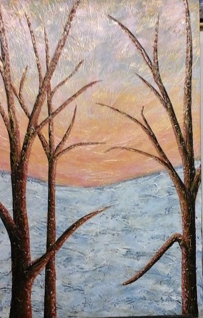
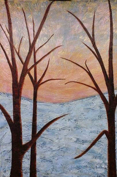
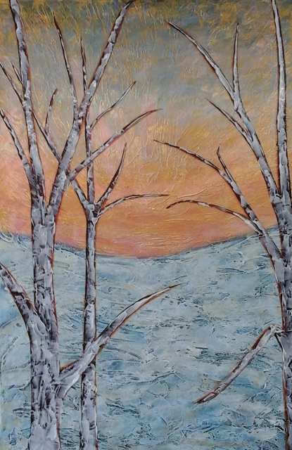
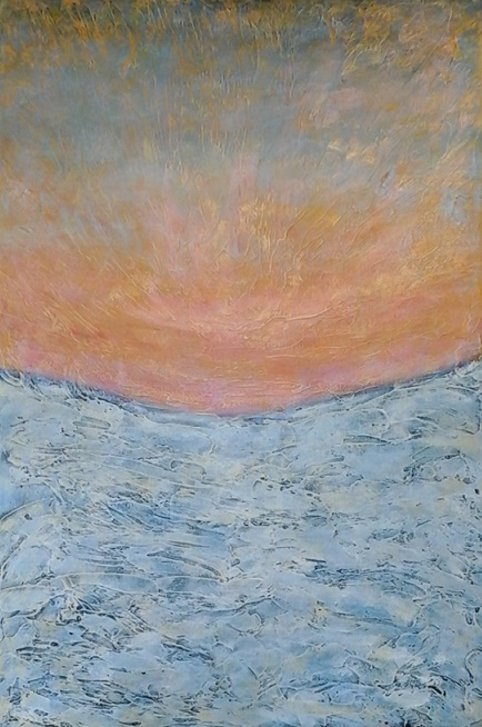
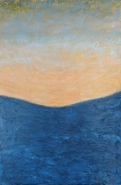
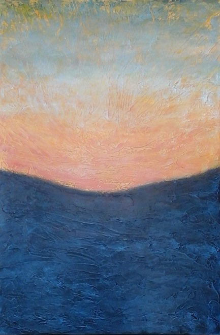
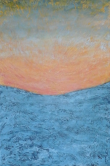
Painting Update: Dusk
After the new layer of gel medium, used to create additional texture for the foreground trees, dried, I was able to apply dark and light paint to create some depth in the trees. Once the basic colours had dried I applied some interference orange to the side of the branches that were highlighted by the evening light.
That done, I applied a metallic gold finish that was applied quite lightly, using a flat brush that was merely dragged across the artwork to highlight the high portions of the painting. It's a technique that I particularly like to use.
Next week Dusk will be finished and then I'll be on to something totally new! Lot's of fun! If you want to follow along please go to my blog at www.susanashbrook.com and subscribe.
For those of you who have already subscribed, if you are enjoying the blog posts I would appreciate it if you would tell one person, who may also enjoy my blog. Spreading the word is important to me, and your help would be very much appreciated. Thank you very much.
Best wishes,
Susan

 RSS Feed