
Today I picked up my new car. The salesman asked me if I was excited to be getting a new car. I never really thought about it. Is one supposed to be excited when picking up a new car? It depreciates the minute you drive it off the lot, you have to insure it, feed it, make sure it gets regular check-ups and bathe it. But, I suppose if it's your "baby" that's not a lot to ask.
For me a car is merely a means of transporting me, my paintings, my art supplies and groceries. It's a balance between the expense and the cargo space... and that "New Car" smell that is raved about... I find it particularly suggestive of the petroleum distillates used in the plastic and carpeting!
Anyway, it is a nice colour... a warm gray (something an artist would appreciate), and it does have heated seats, which I'm hoping will make up, in some way, for the remote start that it doesn't have, and I can still fit my paintings and art supplies in it! Really, what more could an artist ask for? Okay, well, a cube van, maybe?
Today's painting tip: Effective Backgrounds
The colours you use for your backgrounds in your painting will have a dramatic effect on how your painting turns out.
For example, if you are painting a landscape, because cooler colours (those with a blue or green bias) will appear to drop back and therefore create greater depth in the painting. In landscape it is always suggested that you use your warmer colours (those with an orange or red bias) in the foreground to make it come forward, which also increases the illusion of depth in a flat, two dimensional work of art.
When painting still life, florals or anything else where the background colour is yours to choose, think about the colours you are going to use in your subject matter. If your subject matter is predominantly warm colours then a cool coloured background will help to emphasize the warm colours and push them forward. If on the other hand, your subject matter is predominantly cool colours then a warm background will push them forward.
Alternately, say you were painting a pumpkin still life, you could use a complimentary colour to make your pumpkins stand out. I suggest mixing the orange colour of your pumpkins with it's compliment, blue, to create a more neutral gray background which will make your pumpkins pop! Your neutral could easily lean more to the blue to help push your pumpkins forward. You can do this with any of the complimentary pairs... violet and yellow; red and green; and of course, blue and orange.
Not sure about what colour to paint your background? A pretty reliable trick is to mix the colours in your subject matter to create a fairly neutral mix, perhaps with a leaning to the compliment of your predominant colours in the main subject.
An easy background to create is what I call a mottled background. One that I like to use suggests leaves and sunlight as a background to flowers or close-up leaves. I start with a variety of greens and my yellow-green (Hansa Yellow Lt), after determining where my focal point will be. That is where I use the most yellow to create a bright back light to my subject matter. Then I just apply the greens and yellow, using overlapping "X" strokes, with colour applied quite randomly, except where dark and light enhances the composition.
For those who are experiencing a artist's block, doing a series of quick paint sketches of various warm and cool combinations of backgrounds and foregrounds can get you all fired up again. I suggest doing them small, on 5" x 7" canvas boards or paper. Keep them as they make a great resource to refer to in the future.
From my paint box the warm colours would be:
Cadmium Red, Medium or Light - Orange bias
Ultramarine Blue - Red bias
Cadmium Yellow Medium or Light - Orange bias
Sap Green Light (Lightfast) - Yellow bias (if you use tube greens)
The cool colours would be:
Quinacridone Violet - Blue bias
Cerulean or Phthalo Blue - Green bias
Hansa Yellow Light - Green bias
Viridian Green - Blue bias (if you use tube greens)
Phthalo Green - Blue bias
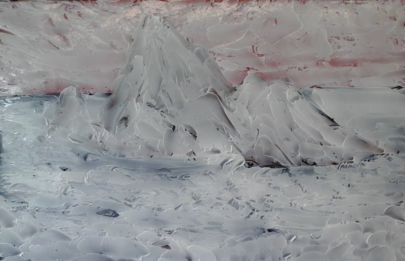
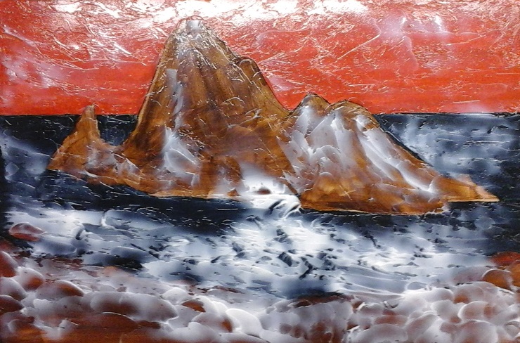
Update on the Painting of Jane's Photograph:
Here is the second stage with the gloss gel medium applied to give the painting texture. The gel medium is applied evenly across the whole painting with a large spatula and then, as you can see in the first photo, the texture is created to mimic the various features of the painting image underneath. The medium will dry clear, as you can see starting to happen in the second photo, and then... well you will have to wait until next week's post to find out about that!
À la prochaine!
Best wishes,
Susan
For me a car is merely a means of transporting me, my paintings, my art supplies and groceries. It's a balance between the expense and the cargo space... and that "New Car" smell that is raved about... I find it particularly suggestive of the petroleum distillates used in the plastic and carpeting!
Anyway, it is a nice colour... a warm gray (something an artist would appreciate), and it does have heated seats, which I'm hoping will make up, in some way, for the remote start that it doesn't have, and I can still fit my paintings and art supplies in it! Really, what more could an artist ask for? Okay, well, a cube van, maybe?
Today's painting tip: Effective Backgrounds
The colours you use for your backgrounds in your painting will have a dramatic effect on how your painting turns out.
For example, if you are painting a landscape, because cooler colours (those with a blue or green bias) will appear to drop back and therefore create greater depth in the painting. In landscape it is always suggested that you use your warmer colours (those with an orange or red bias) in the foreground to make it come forward, which also increases the illusion of depth in a flat, two dimensional work of art.
When painting still life, florals or anything else where the background colour is yours to choose, think about the colours you are going to use in your subject matter. If your subject matter is predominantly warm colours then a cool coloured background will help to emphasize the warm colours and push them forward. If on the other hand, your subject matter is predominantly cool colours then a warm background will push them forward.
Alternately, say you were painting a pumpkin still life, you could use a complimentary colour to make your pumpkins stand out. I suggest mixing the orange colour of your pumpkins with it's compliment, blue, to create a more neutral gray background which will make your pumpkins pop! Your neutral could easily lean more to the blue to help push your pumpkins forward. You can do this with any of the complimentary pairs... violet and yellow; red and green; and of course, blue and orange.
Not sure about what colour to paint your background? A pretty reliable trick is to mix the colours in your subject matter to create a fairly neutral mix, perhaps with a leaning to the compliment of your predominant colours in the main subject.
An easy background to create is what I call a mottled background. One that I like to use suggests leaves and sunlight as a background to flowers or close-up leaves. I start with a variety of greens and my yellow-green (Hansa Yellow Lt), after determining where my focal point will be. That is where I use the most yellow to create a bright back light to my subject matter. Then I just apply the greens and yellow, using overlapping "X" strokes, with colour applied quite randomly, except where dark and light enhances the composition.
For those who are experiencing a artist's block, doing a series of quick paint sketches of various warm and cool combinations of backgrounds and foregrounds can get you all fired up again. I suggest doing them small, on 5" x 7" canvas boards or paper. Keep them as they make a great resource to refer to in the future.
From my paint box the warm colours would be:
Cadmium Red, Medium or Light - Orange bias
Ultramarine Blue - Red bias
Cadmium Yellow Medium or Light - Orange bias
Sap Green Light (Lightfast) - Yellow bias (if you use tube greens)
The cool colours would be:
Quinacridone Violet - Blue bias
Cerulean or Phthalo Blue - Green bias
Hansa Yellow Light - Green bias
Viridian Green - Blue bias (if you use tube greens)
Phthalo Green - Blue bias
Update on the Painting of Jane's Photograph:
Here is the second stage with the gloss gel medium applied to give the painting texture. The gel medium is applied evenly across the whole painting with a large spatula and then, as you can see in the first photo, the texture is created to mimic the various features of the painting image underneath. The medium will dry clear, as you can see starting to happen in the second photo, and then... well you will have to wait until next week's post to find out about that!
À la prochaine!
Best wishes,
Susan
 RSS Feed