Susan Ashbrook - artist and teacher
  • Home
  • About
  • Gallery
  • Fall Programs
    • PROGRAM INFORMATION
  • Testimonials
  • Ashbrook Creative Products
  • Blog
  • Contact

ENOUGH ALREADY!

5/3/2017

1 Comment


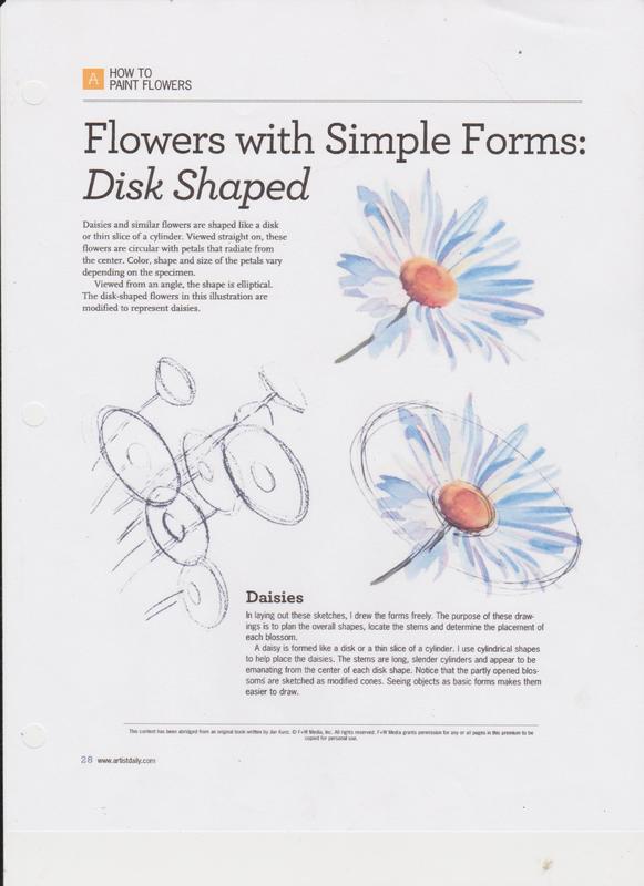
​...and it rained for 40 days and 40 nights... well it seems like it has.  The rivers keep rising.... sandbagging, evacuations and roads buried by water. The rocks and things that I use to judge how high the river is have all been drowned, including my neighbour's dock, which hasn't been seen for a week.
 
I went into Rockland to pick up a few things on Tuesday and the waterfront homes were surrounded by water... the river on one side and the flooded road on the other. Fortunately the houses were built up higher on the lots than the river and the road, but people were busy sandbagging just in case. On the way home I found the lineup for the ferry at a stand still and two tractor trailers backing up the road, away from the ferry. It seems that the water is over the wharf, and while they have been building it up with earth, it was deemed too dangerous to get fully loaded tractor trailers onto the ferry. The risk of them tipping over was too great.
 
Hopefully, with no rain today and maybe not tomorrow the river will drop a bit, but the forecast is for more rain starting Friday and running well into next week. Gonna need to get that Ark built in a hurry or strap a keel and rudder onto my house!

​Painting Tip: Some Acrylic Paint Issues and Fixes
 
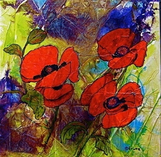
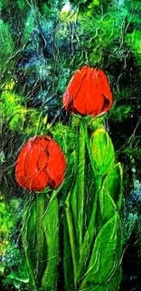
I am continuing to work on my four seasons pieces, but ran into some problems with paint, so I thought I would expand on that for you today.
 
Paint Drying in the Tube:
Today I needed to dig out my Titanium Buff and Naples Yellow. Both are useful colours but not colours that I use often, so I had stored them away in plastic bins. When I hauled them out both colours had started to dry in the tubes. They were too thick to squeeze out of the tubes so I cut them open to expose the paint, which I was able to use by adding water and mixing, and mixing, and mixing. The Naples Yellow was in a metal tube with a hard plastic screw-on cap. There was a build up of paint which prevented an airtight seal. The other tube was clear plastic with a plastic screw-on cap. Unfortunately I had closed it without expelling the air inside the tube and so the paint started to dry out. Both could have been kept fresh with a little more care on my part.
 
If you find your paint has started to dry in the tube, I suggest that you cut the tube open and transfer the paint into a small, airtight jar. (I use the 125 ml mason jars because they are small enough, have an airtight seal and when the lids and inserts rust, you can replace them for a few cents each.) Once the paint is in the jar spritz it with clear water and seal the jar. The water will be absorbed into the paint and, as long as it is not too far gone, will get back to it's original consistency, by adding and absorbing water as needed. This trick will also work with acrylic mediums. You can add up to 25% water to any acrylic product and not do it any harm.
 
Lifting Dry Paint:

Speaking of how much you can thin acrylic products, have you ever had dry acrylic paint lift of the canvas when you paint over it? This can be caused by mixing too much water with your paint, which breaks down the ability of the polymer medium to bond the pigment to the canvas.
 
If you have this problem you can very carefully apply a coat of liquid medium over the area to try and seal it. To avoid the problem in future, use Liquid Medium to thin your paint. If you prefer a more watery consistency medium, you can thin it up to 25% with water.
 
Colour Shift:
Colour shift refers to the change in the colour of acrylic paint when it dries as compared to while it was wet. This happens because the polymer binder used in acrylics is milky in it's liquid state, but it dries clear. This is more pronounced in student grade and inexpensive paints.
 
Once you become familiar with the amount of shift your particular brand of paints cause you can adjust your colour mixing to match a previous colour. You could also use a higher quality of paint, or, you can add a bit of Zinc/Mixing White (PW4), which is a transparent white, so it doesn't make your colour chalky, but does compensate for the polymer becoming clear.
 
Paint Drying Too Fast:
This is a common complaint about acrylics, one that I also had when I first started using them.  Because acrylic paints dry through the process of evaporation, the weather/atmosphere also affects the drying time, so if it's a damp rainy day (like we've been having) they will dry more slowly. On a hot dry summer day, or in an air-conditioned room they will dry much faster.
 
There are ways to compensate for this though. Spritz your palette with water as needed, which is my favourite method; use acrylic retarder, which can be brushed on your canvas where you are going to paint, or mixed with your paint; or you can purchase Golden Open Acrylics, which have a drying time of about 4 hours.
 
Not Drying at All:
This can be the result of having used too much retarder with your paint... always a good idea to read the label to see how much is recommended. The alternative is removing as much of the paint that won't dry, as you can, from the painting and starting again.
 
Paint is Not Covering What is Underneath:
This can be a pain if you are trying to paint over a background or strong colour, and has to do with the transparency or opacity of the paint you are using. Paints that conform to the ASTM (American Society for Testing and Materials) standards will list the opacity/transparency level on the label.
 
Options include multiple layers of colour to hide what is underneath; painting the area in question white and then recolouring it; switching to a more opaque version of the colour; or adding a little Titanium White, (PW6) which is very opaque, to your colour. I have also tried a medium which is supposed to increase opacity optically, but wasn't overly impressed with it.
 
Varying Levels of Gloss and Matte in a Painting:
Different pigments have different qualities and some dry more matte, or glossy, than others. To solve the problem it is a simple matter of giving the painting a coat of medium or varnish in the sheen that you prefer. Many mediums and varnishes can be mixed (the same type by the same manufacturer) to create a custom sheen.
 
Pigment and Binder Separation:
You squeeze the paint onto your palette and you get a clear, jelly like substance with no pigment. I have experienced this with one particular brand of paint, many years ago, but not so much recently. In the artist paint industry it is referred to as being "overbound", which translated means that there is more binder than needed for the pigment load.
 
Short of getting your money back or a replacement from your supplier or the manufacturer you can squeeze it into one of those little mason jars (gotta love them!) and mix it back together and continue to use it.
 
So there you have it! If you run into problems with acrylics please feel free to contact me, because I probably have an answer to your dilemma!
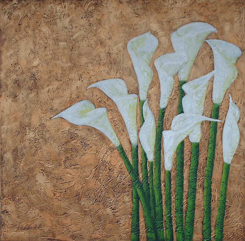
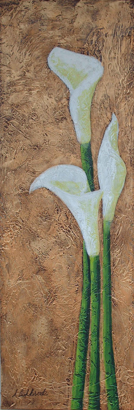
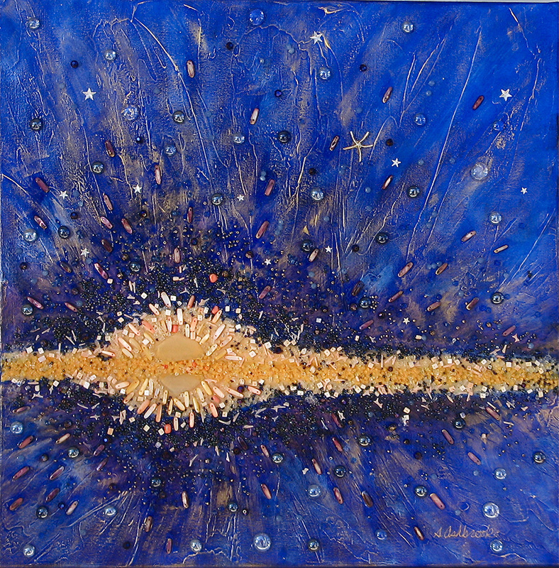
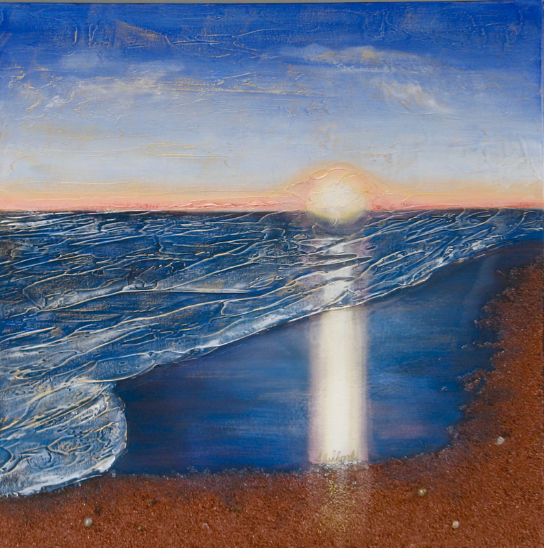
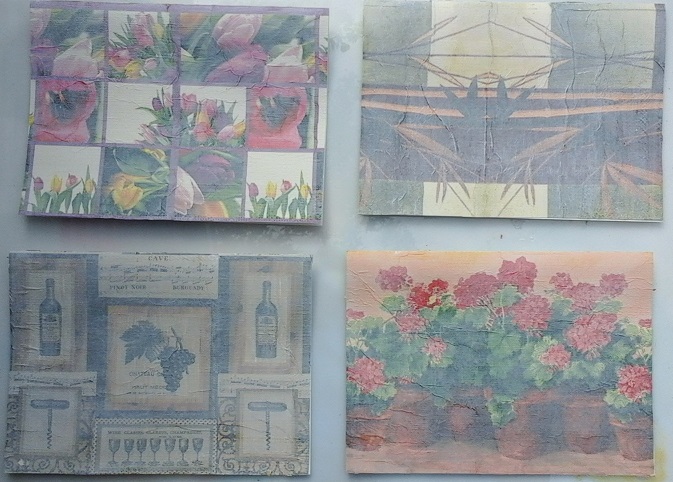
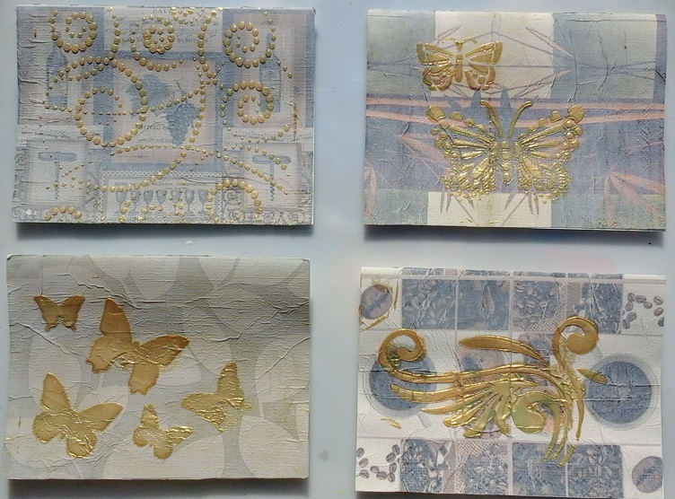
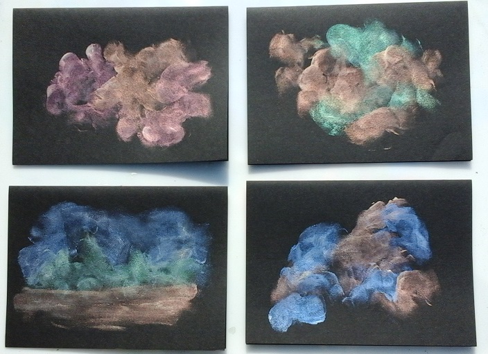
Painting Update:
 
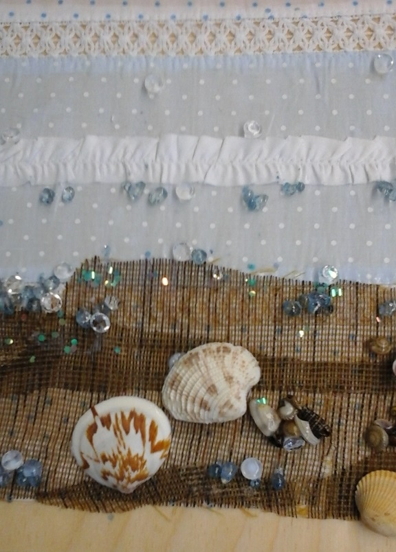
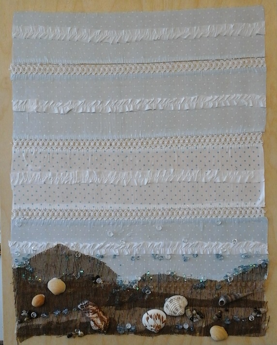
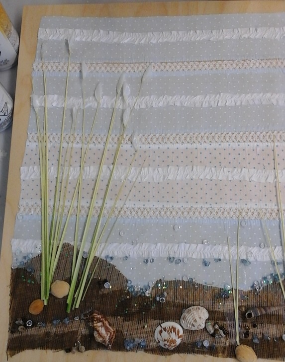
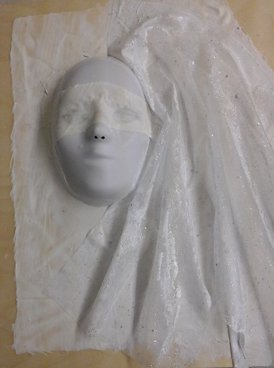
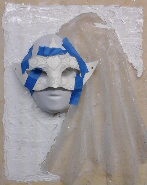
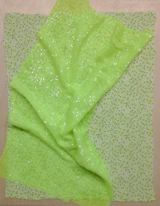
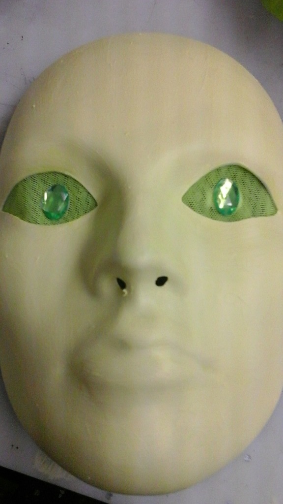
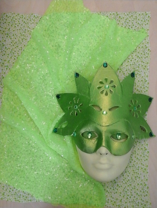
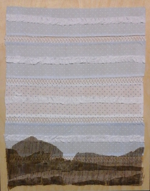
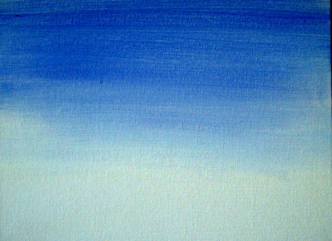
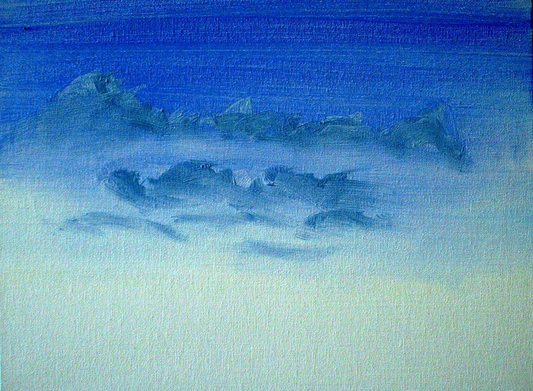
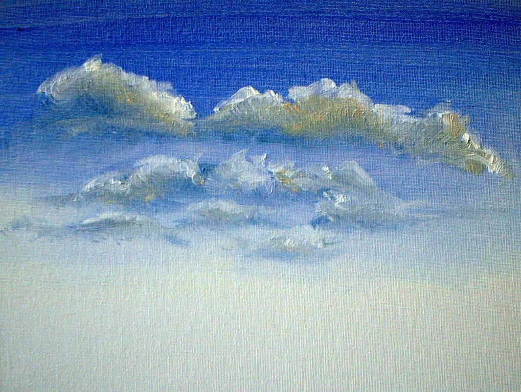
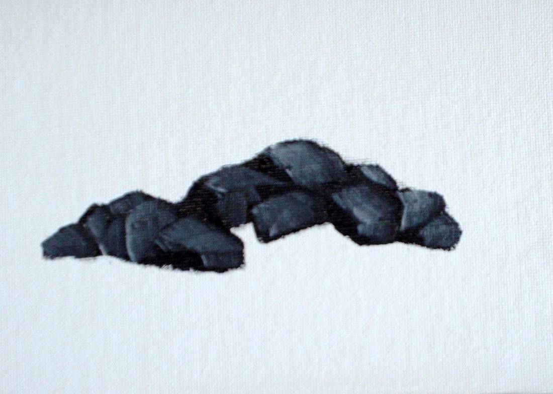
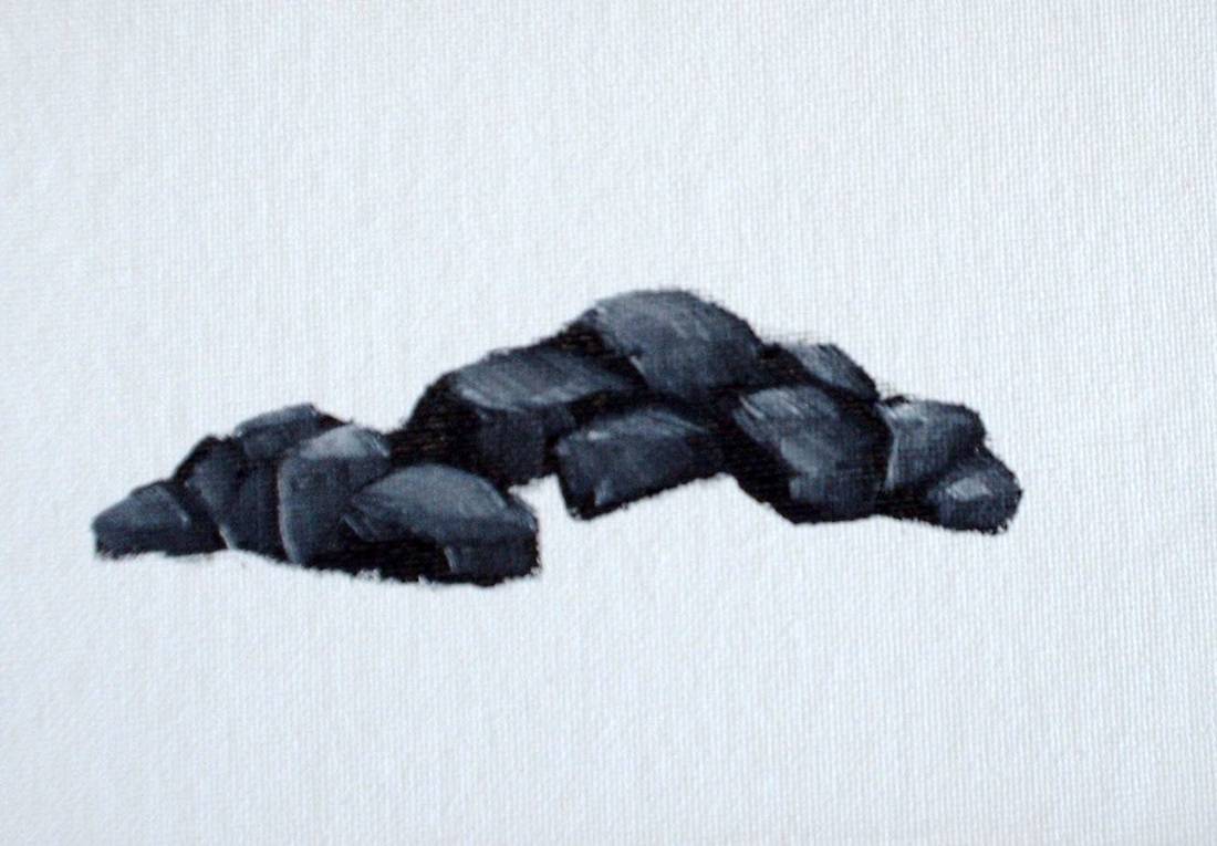
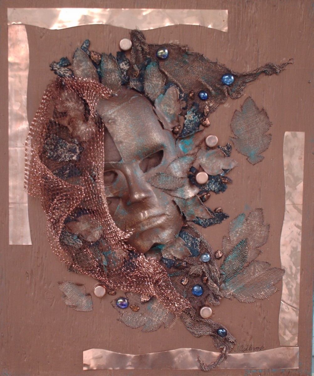
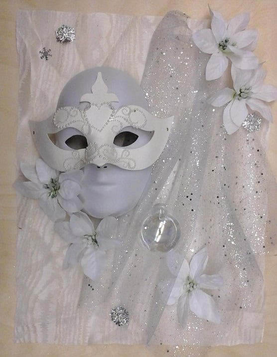
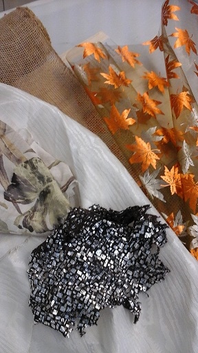
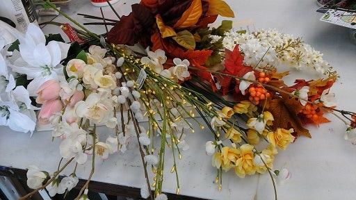
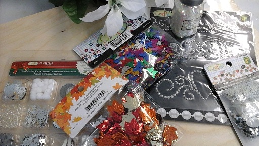
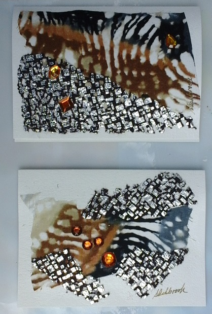
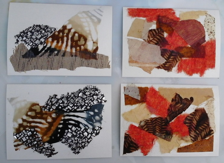
Lately I have been working on my Summer piece of the four seasons series. This is the one I have struggled with the most. Summer conjures up ideas of bright colours... the brilliant beach umbrellas, the riot of colours in the garden, and flashy shorts, bathing suits and beach towels, but it wasn't coming together for me. I kept gravitating towards the colour blue. I found a piece of fabric that I knew was perfect for the background and had to have it even though the plan had not developed.
 
Later, in a moment of inspiration I realized that the blue was a summer sky and white was the surf on the water and the colours suddenly worked together as beach colours... sand, sea, surf and sky. Summer for me is a time to relax and unwind, which fits with my choice of colours and materials for this particular piece. It's the influence of past holidays on the eastern coast of North America. I'd love to get the beach donkeys of the UK included, but I think that will be another piece altogether.
 
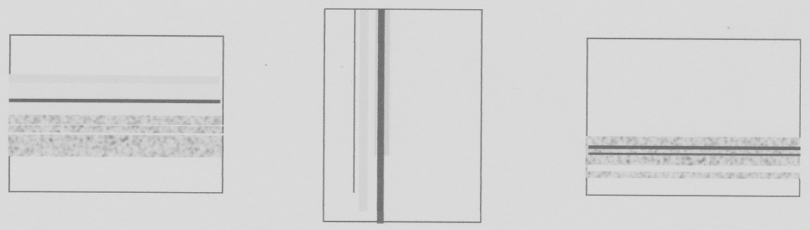
So, here's where Summer is right now..
​I'd also like to let you know that I have some workshops coming up in June that you might be interested in. 
Picture
DISCOVERING ACRYLIC MEDIUMS    
This workshop will combine demonstrations and lots of hands-on practice with the mediums listed. Students will need to bring one or two paintbrushes and a standard palette knife (plastic ones are fine). All other materials will be supplied. Participants will create a number of works of art during the workshop. Don’t miss out. Sign up today!
What you will learn:
Polymer medium: How and why to use it
Self Leveling Gel: Marbling; Making texture mediums
Gel Medium: Creating texture; Adding interest; Extrusion;
How to make photocopy transfers;
How to make “skins”
Light Molding Paste: Creating a unique painting ground
Clear Tar Gel: Drizzling
Texture mediums: Different types and uses
Pouring medium: Create some really
neat artwork!
Saturday, June 3, 2017, from 12:30 to 4:00 PM
Fee: $75
Kevin Dodds Gallery: 1101 Bank Street, near Sunnyside, Ottawa

Information and Registration: ashbrookcreative@gmail.com; www.susanashbrook.com; 613-833-8312 
Picture
AWAKENING YOUR ARTIST’S EYE WORKSHOP
This workshop is all about learning to see and think as an artist. A series of exercises will help this become second nature so that you will easily recognize potential subject matter, instinctively know what colours to use and develop the internal tools to become a better artist, no matter what your medium. We will consider perception, seeing rhythm and patterns, what to leave out and much more. Students will need to bring their basic art supplies (any medium) and a sketch book.
Sat Jun 17, 12:00 to 4:00 PM
Fee: $45
Susan's Studio: 2531 Manse Rd, Cumberland Village, Ottawa
Information & Registration: ashbrookcreative@gmail.com;
www.susanashbrook.com; 613-833-8312 
​
Thanks for tuning in!
Best wishes,
Susan
1 Comment

SPRING IS SPRUNG, THE WATER'S RIZ, I WONDER WHERE THE FENCE POSTS IS?

4/5/2017

2 Comments

 
Just a memory of spring on the farm in Maxville ON. No birdies, but a ton of water! 
Last class of the winter session this week! Then a couple of weeks off to re-organize my suitcases of art supplies before the spring session. The suitcase is an interesting piece of gear for me. Over the 10 or so weeks of classes it gets heavier and more cluttered with things that get added for a specific class and then tend to stay until the end of the session... thus spring cleaning is mandatory! You'll also hear a lot of "Oh, that's where that went!" as I sort it out!

Lots of new stuff happening this spring... I have booked a new retirement residence for twice monthly classes, starting in May. It's Governor's Walk Retirement Residence in New Edinburgh. I worked with them when I was on staff at the Nectar Centre, coordinating programs between the residence and the centre.  A great team to work with and I’m looking forward to it!
 
I have a new commission for a painting that will coordinate with my client’s formal dinner ware, for her dining room. The dishes have a small floral print in pink, yellow and blue. It's very pretty and didn't take long for some ideas to form in my mind.  In fact, I just sent off a preliminary sketch to her for approval before I proceed to the next step. It's important for the client to give input and feel like she has helped create this very personal piece of art.
 
And still with more news... this week I'm meeting with a potential corporate client who is interested in learning more about leasing my art for his location of collaberative space for small businesses and startups. It’s called Collab Space and is at 70 Bonguard Ave, just off Merivale Road, near Slack Road. I am also exploring using the space for workshops and classes in the west end of town. You can check it out at https://www.collabspace.ca/en.
 
Speaking of classes and workshops, I have my spring program ready to go… please check out the programs page on my website www.susanashbrook.com/ to see what is being offered… the workshops are getting excellent response so if any of them interest you please let me know right away to hold a space for you.

Today’s Painting Tip: Seeing Shapes
 
I am often asked by students how to paint or draw something, and for me it is simply a matter of looking at the object and painting what I see. But this comes from years of learning to see and respond as an artist. Recently at my beginners painting class I was asked how to draw/paint flowers, which made me think how one could teach others how to paint them. After some analysis it became clear that it’s all about shapes. For example, a daisy is a circular centre with a circular array of petals radiating from that centre. Okay, so let’s look…

Picture
​There are also other flower forms… foxgloves for example, which are conical flowers that grow downward along a vertical stem. And not to be out-done, hyacinths are also cone shaped flowers on a vertical stem, but they look in a number of different directions from the foxgloves. 
Think about the shape of a cat’s face… rather triangular, with triangular ears. This will give you your basic shape on which to refine your drawing. Basic shapes are a place to start and will make it much easier to develop a more refined work.
 
Seeing like an artist is something that is learnable and, for those of you that are interested in learning the skills, I am offering a workshop "Awakening Your Artist Eyes" on Sat Jun 17 from 12:00 to 4:00 PM at my studio. Let me know if you are interested.
 
Painting Update: Winter on a comeback
Don’t worry, winter is finally over here, however my winter piece is now developing the way I wanted, after a false start!
 
Having had the background fabric become transparent, disappearing into the colour of the wood panel when applied with the fabric hardener, I started again by applying white paint to the panel, where the fabric would be applied. It worked! The fabric has maintained its colour and also the beauty of the moiré pattern.
 
Then I painted the white face mask blue and added some blue interference paint to create a shimmery, winter feeling. To glue the mask onto the panel I used some of the background fabric with the fabric hardener and created some shimmer on it with the interference blue. I love the effect because it changes as the light does, or as you move around the piece.

​I also worked on the masks for the fall piece. I went with the strong colours of Burnt Sienna and Quinacridone Violet… because I felt like it! (No ‘splainin’ when it feels right to an artist!)

​By the way, I am looking for names for my four-season pieces. Something more interesting than Fall, Winter, Spring and Summer. I was thinking of Snow Queen for winter, Prince of Leaves for fall, but Spring and Summer have me stumped. I would appreciate any suggestions that you might care to offer. The subject is the season personified as a character, muse or magical being. I will offer a small gift for the chosen name for each of the four pieces, so if you have ideas, please let me know, either in the comments section or by email.
 
Thanks for taking the time to enjoy the blog. As always, I invite you to comment, make suggestions and share your thoughts.
 
Best wishes,
Susan
2 Comments

I'm Trashing Winter!

3/15/2017

2 Comments

 
Well, last week was an interesting week here.  I've struggled with Winter and finally decided to scrap it and start over (details below).
 
I also participated on the jury for an art exhibition being put on by one of the Ottawa art associations. This was a really great exercise for helping me deal with my ongoing battle with Winter... like a breath of spring air cleaning out those stuffy winter cobwebs!  When jurying I am always amazed at the artistic creativity presented: the different approaches to subject matter; unique handling of media; the skills involved in creating the art; and the pleasure it brings to viewers. I was not disappointed with this show! Check it out if you get a chance. It's "Spring Fling" presented by the West Carleton Arts Society www.westcarletonartssociety.ca/ at the Kanata Civic Art Gallery at 2500 Campeau Drive. It runs through March 19, 2017. 
 
In hope of Spring, I also changed my paintings at the Kevin Dodds Gallery, taking down winter themed paintings and hanging weather themed work.  The subject matter seems very appropriate as I have noticed that there is always some form of precipitation on Tuesday evenings, when my class at the gallery runs... snow, rain, freezing rain.  If you are in the vicinity of 1101 Bank near Sunnyside, please take a few moments to drop in and take a look.
 
This week is March Break for most schools, so many courses have been replaced by programs to keep kids busy while on their break… perhaps a chance to get some of my own work done in the studio. We shall see!

Painting Tip: Tissue Paper Backgrounds
 
These wonderful pieces can be used as backgrounds for things like floral paintings or part of an abstract or mixed media piece or gift wrap! If they turn out well enough they can be a finished painting just needing to be fixed to a canvas or board. You can adhere them to a surface with the use of polymer or gel medium. 
 
You will need:
  • Tissue paper
  • Liquid polymer medium
  • Water
  • Small container for mixing liquid paint
  • Liquid paint
  • Acrylic Inks
  • Garbage bag
  • Soft wide synthetic brush
  • Spray bottle
 
 
The process:
  1. Lay the tissue paper on the garbage bag on your work surface
  2. Mix a watery mixture of liquid paint with water and polymer medium
  3. Gently brush it on the tissue paper
  4. Let dry or continue working wet
  5. Drop ink on the tissue and allow to run by lifting the garbage bag at the edges
  6. Use a water spritzer to make the ink run more
  7. You can work wet and let the colours mix or you can let each colour dry before adding the next. It should be noted here that complimentary colours (blue/orange; red/green; and violet/yellow) will produce some neutral combinations when mixed together wet. This is neither good or bad, just depends on what you want to produce.
  8. Let the piece dry completely before lifting it off the garbage bag and using.
 
Take a look at what artist Erika Déruaz www.erikaderuaz.com/ has done with some of her tissue paper backgrounds.
Painting Update: How Winter got Trashed
 
After gluing down the white moiré fabric, for Winter, it went clear when it dried and pretty much disappeared into the panel. I tried working with white and pearl inks, to bring back the white, but was not satisfied at all. Then I mixed up some white paint and gel medium to create the suggestion of snow, but I can't get the mixture under the mesh fabric so it looks silly. I have decided to trash the first version and start Winter again. Oh well, at least I've tried some different stuff and now have a better idea for doing the next one as I want it. It’s all part of the artistic exploration!
I started the background fabric for Spring and did some playing with the pieces, for composition, then I did the Spring masks using gems for the eyes. I think it looks better than those hollow lifeless holes that the masks come with. I also played with the fabric I got for Summer but felt that it was too different from the other seasons, so I planned to use that for an individual piece instead of the series. After leaving it for a few days I had another idea… sand and sky for summer. I played around with it for a bit and was really pleased with what happened. Now Summer is talking to me!
So, Winter has been trashed, although most of the parts have been salvaged and the panel can be used for a more textural piece; Spring is well on its way (in spite of the recent snow), with the background in place and the masks prepared and ready for attachment; and Summer is not too far down the road, with the background applied and lots of great ideas wanting my attention… I hear the studio calling! We'll chat again soon!
 
Best wishes,
Susan
2 Comments

Spring is Coming!

2/22/2017

2 Comments

 
Another busy week, but I did manage to get to a couple of fabric stores and picked up some fabulously flamboyant fabrics for use in my work. It’s easy to justify purchasing fabric for art, but for sewing projects not so much, as I never seem to have the time to get them sewn!
 
Speaking of fabrics, I had the following question from fellow artist, Susan Irving  www.applesandart.ca/susan-irving/ …
 
“Looks like that is going to be fun! I was at a vernissage recently and much of the abstract art contained feathers and fabric, which did not seem to be treated in any way. I was wondering how that would hold up over time. What are your thoughts on this?”
 
Here is how I answered Susan …

“I would expect untreated fabric to break down over time, especially natural fibres. For example, about 30 years ago I made cotton lap quilts and the cotton fabric is now starting to disintegrate. Acrylic mediums, and Paverpol fabric hardener (also an acrylic polymer product), seem to slow down the process a great deal. I have a heron sculpture that I made with fabric and Paverpol and it has been out, year-round, in my garden for six or seven years and still looks like the day I made it. It is also important to note that untreated fabrics can collect dust and dirt, while those that are protected can simply be wiped clean with a damp cloth, or dusted with a house painter’s brush.
 
Feathers, I think, are a little more durable... like human hair, but I would still treat them with a polymer medium as it does slow down fading and aging. I once tested images printed using non-archival inkjet printer inks. Half I coated with acrylic medium and half I left uncoated. The uncoated ones faded very rapidly while the coated ones did not, in fact I got tired of having them on my window sill and finally threw them out, with almost no fading... I also had some that I kept in the dark as a control, to gauge the fading.
 
Even the great masterpieces need conservation from time to time, as the oil paint starts to crack and peel or the canvas eventually starts to rot and disintegrate. Fortunately, we have conservators who can preserve these wonderful paintings.”
 
Watch for Spring, coming in my next blog... with or without groundhogs!
 
This Week’s Painting Tip: Painting from Dark to Light
 
For those who paint in more opaque mediums, such as oils, acrylics and pastels, working from dark to light gives a painting an additional level of depth.
 
When painting trees I start with the darkest greens and then apply a minimum of two more layers of lighter greens to create depth. Think about it, the darkest greens will be in the shadows, underneath the leaves that are directly hit by the sun. Working from dark to light puts those shadows exactly where they need to be to create a natural looking tree. Same thing with tree trunks… I start with the darkest colour, add a medium and then the highlights.
 
You can apply this approach for everything… rocks, clouds, animal fur, human hair, waterfalls/water of any type, faces, fruit… anything! 
An excellent exercise is to start with a black canvas and start with dark colours and work your way to the lighter colours. By the way, Black Gesso is one of my favourite friends, especially when working in abstract. It covers old paintings well and provides a wonderfully creative surface to start on again. 

Here is one of my paintings that rose from a black canvas...
Picture
Here is an excellent video, showing artist Marcel Witte painting polar bears on black. It is amazing and shows just what can be achieved by painting dark to light. Enjoy!
Polar bear painting: https://www.facebook.com/uniladmag/videos/2607618319261211/
 
Painting Update:
 
Winter is progressing, and while I’m still seeking a few items to add to it, I got started laying down the background fabrics. Both the moiré taffeta and the glittery net were dipped in Paverpol, the excess removed, and then applied to the birch panel. The moiré fabric was laid flat, but with the net fabric I created waves, like an icy winter wind. I used dressmaker pins to hold the net in place until it is dry, when I will remove them. Hands also become works of art while working with this stuff!
​After applying the background the full-face mask was next. I covered the open eyes of the mask with the same fabric as the background. This is to eliminate the rather ghostly appearance of the eye holes with no eyes. Now it just appears that the person in the mask has their eyes closed, and it looks much better! I also used some of the background fabric to anchor the mask to the panel. This will be obscured by additional pieces of the artwork.
Picture
​Next will be the primary mask and the silk poinsettias and all the bling, but right now I’m waiting for everything to dry… always, always waiting for stuff to dry! Whoever said that acrylics dry too fast??
 
Thanks for joining me today. I hope you will join me again soon… you can subscribe to my blog from my website at www.susanashbrook.com/blog. Also, please let me know if you enjoyed the blog, subjects that you would like to see covered, and any questions that you may have.
 
Best wishes,
Susan
2 Comments

And Winter Continues...

2/10/2017

2 Comments

 
It’s been a busy week for me and so this blog will be short, but hopefully, no less interesting for you, as I tell you about winter.
 
Today’s Lesson: Framing
The subject of framing artwork is an ongoing discourse… some artists do, some artists don’t and the reasoning is as wide ranging as from here to there!
 
Professional gallery owners always want the work that they sell to be framed. While some artists believe this is so that they get the income from framing the work, it is not usually the main reason. Unframed art, including gallery depth (1 ½”) canvases, always look better when they are framed. It’s the packaging of the artwork… the bow on the birthday gift, the heart shaped box that contains the chocolates. It’s what finishes the product and makes it more appealing to the customer. Try it yourself. Take a photo of one of your paintings without a frame, then take a photo of the same painting framed. Compare the two. What do you think now? Which one will command the higher price?
 
I often hear artists say that buyers prefer to select their own frames for their newly purchased art, but the fact is that the majority (80%) of buyers just want to take it home and hang it over the sofa. They just want it to look good on their wall with as little work as possible, beyond purchasing it and hanging it on a picture hook.
 
For those who see the advantage of framing their work there are a number of options. There is the relatively inexpensive choice of ready-made frames in standard canvas sizes. These come in a variety of styles and colours, including the traditional frame with a white or cream liner and the more contemporary floating frame that leaves a space between the canvas and the frame. These are usually available at art supply stores and some framing stores, who will install your work in them for a nominal fee, or you can do it yourself if you are so inclined.
Ready Made Traditional
Floating Frame
Traditional Frames
Contemporary Custom
Custom Frame
Custom Frame
The other option is custom framing, which does cost more, depending on what you choose and where you have it done, but can still be very affordable.
 
If you are planning to sell your art I suggest a standard frame for all of your pieces, perhaps with variances in colour to work best with what you are framing. This makes it much easier for you, your framer and also keeps framing costs consistent so you know what it will cost you for each piece.
 
So now the choice is yours to make! Let me know what you think.
 
Painting Update:
After my class last Thursday, I stopped in to the art supply store to pick up the two cradled wood panels that I need to start my Four Seasons. I had tried to get them a couple of weeks ago and although they showed having 20 in stock, none were to be found. They told me they would be ordered and probably in stock in about two weeks. Today they told me they would be in stock in mid-February. I did a re-think as I am keen to get started now, and decided to go with a different size which was in stock. But while considering my options, I made some changes to the plan in another way too.
 
Cradled wood panels come in two depths… gallery and studio, gallery being about 1 1/2” deep, while studio is about 5/8” deep. Initially I wanted to go with studio for all four panels, but then I got to thinking, what about if I did two of each depth creating an undulation of depth when they are hung together? I liked it, so that is what I decided to do. I just love the way work progresses as obstacles and options appear! As I say in my Artist’s Statement “For me the thrill of creating art is in the process!”
 
Having acquired the panels my next step was to prepare them with a clear coat to seal the wood and prepare it for taking the masks etc that will be applied. For this project I am using a product called “Paverpol”.  
Panels: Paverpolled and Plain
Paverpol Medium
​It is a polymer based medium, similar to some acrylic mediums, which, when applied to fabric becomes rock hard once dry. It comes in a variety of colours, including transparent, which, although white in its liquid state dries clear. This product can open up a whole new world for the artist, including 3D work. Below are some samples of work I have used it for. 
Melissa and Melinda
Keeper of the Garden
​For more information about Paverpol take a look at this website: http://www.paverpol.com/prestashop/en/  
 
Once the panels were dry I just couldn’t resist laying out the first piece, Winter… just to see how it looks. I took a photo of it (see below) so I could assess my layout and determine what other product I need to complete the design. Once I am happy with it I will photograph it again and then using the photo as a guide, rebuild it in its final form.
Picture
Thanks for taking the time to read my blog. If you enjoy it please subscribe by entering your email address and clicking on the subscribe button on the blog section of my website. You will receive an email from Feedburner asking you to confirm your subscription to finalize it. You can unsubscribe at any time.

Best wishes,
Susan
2 Comments

New Ideas Brewing!

1/28/2017

4 Comments


​I've had some ideas brewing in my brain for a new series of artworks and have been gathering the materials as I find them. The series is themed on the four seasons and will be four mixed media pieces on cradled wooden panels... each piece depicting one of our seasons.
 
I have gathered masks, two for each piece, that will be painted and appointed to personify the season; artificial flowers and leaves for each season; fabrics for backgrounds and other applications... I always check out the remnant bins at fabric stores as they are a veritable source of blow-my-mind amazing fabrics; little shiny bits for glitz and bling; stencils to add dimension; and lots of exciting acrylic mediums for texture.
 
There is still more stuff to find, and I hope to find it all soon, as I am excited to get going on these pieces. The one thing I do want to be able to do is bring all four pieces along at the same time, which means preparing all the backgrounds at the same time, then preparing all the masks at the same time, etc, etc. As a series, I want them to be able to hang together cohesively, which is easier to achieve by doing them all at the same time.
 
As I started planning this series, I began wondering what other themes would also work well as a series. I thought about weather, professions, and signs of the zodiac. I would love to hear other suggestions, so if you have any ideas please let me know.
 
Planning has begun for the second annual 2017 NEST Studio Tour in New Edinburgh and this year it will be held on September 16 and 17. I will be participating, as will Karen Dyrda, with whom I shared the "studio" location (255 MacKay Street) last year. Again, this year there will be demonstrations and door prizes. I'll let you know more about it closer to the actual dates.

Painting Tip: Abstract Composition
 
The interest in abstract painting is increasing and, as with everything else, there is good abstract, mediocre abstract and poor abstract. Abstract does not show the viewer something that they recognize easily, like a bowl of fruit or a landscape scene, so in order to take the viewer into the painting the artist needs to use a strong sense of composition.
 
As in traditional painting composition takes the viewer through the painting on a continuing basis, so that they see new things each time their eye rotates through the piece. In fact, the composition styles for abstract mirror those used in traditional painting.
 
Here are some of the composition styles that you can use in abstract work:
 
Closed
The subject matter tends to be in the middle or slightly off middle of the painting, with a border all around the edge of the piece.

Picture
​“S” or “Z”
The flow into and around the painting follows the shape of an “S” or “Z”. This patterns will draw the viewer’s eye around the painting quite effectively.
Picture
“L”
This composition pattern creates an “L” form. It works horizontally and vertically from either side of the page. This is a good style to use dripping paint with, allowing it to run down the side of the “L”.
Picture
Diagonal
Diagonals create a sense of action and can work either horizontally or vertically. Care must be taken so that they do not go into the corners of the painting as this will lead the viewer’s eye out of the piece.
Picture
Cruciform
This is one of the most popular and effective composition styles in abstract work. Be sure that you don’t divide you canvas or paper into equal portions as that will make the composition ineffective. Try to vary the cruciform with line thickness and event multiple lines
Picture
Grid
Create a grid formation (uneven) using an underpainting that will guide you through the paintings development. Use masking take to make a negative grid with various rectangles of colour.
Picture
Layered
Layering can be horizontal, vertical or both and involves applying layers of colour on top of colour. The colour can cover the whole page or part of it… artist’s choice. Texture is also effective in this style as is applying your grid with masking tape, painting over it and then removing the tape..
Picture
Try drawing some lines with a permanent marker and then applying paint over some of the areas. A palette knife works well for this exercise as it keeps you from getting overly detailed.
Painting Update:
Here are some of the things I've been gathering for this new series featuring the four seasons... 
4 Comments

A New Beginning!

9/1/2016

2 Comments

 
​After my two and a half year stint at Santé Restaurant and Gallery, which did well for both the gallery and myself, I have not been represented by a gallery. Then, not too long ago, I heard that another gallery was taking applications from artists, so I applied.
 
Well, it's official now... on Tuesday I signed a contract with the Kevin Dodds Gallery (KDG), and my work will be exhibited there starting September 1.
 
The gallery is at 1101 Bank Street, in Ottawa, which is just south of Sunnyside Avenue. It's a charming little gallery and, as I'm finding out, it is quite well known. One of the things that attracted me to it was the work of the artists... contemporary with a wide variety of mediums and styles... not the basic traditional work that one finds in many galleries. As an "Artistic Explorer" this appealed to me. If you like my work you will enjoy the work on exhibit. Some of my clients are also big enthusiasts of the KDG, which  seems to bode well for a good relationship! See more at kevindoddsart.com/.
 
So Wednesday I spent the day sorting through paintings to select for the gallery, then checking them out to make sure there were no scuff marks on corners and that they were properly varnished. Some had not been varnished, which prompted a rush trip to the art store for a supply of varnish, but they are all done and ready to go now. Whew!
 
I will also be teaching at the KDG and am in the process of setting up classes and workshops for the fall session... more to come on that next week!
 
In the meantime, I have my fall class lineup now on my website www.susanashbrook.com. Please see if there is there is anything you are interested in and let me know. Classes are already starting to fill up.
 
Painting Tip: A 3-Step Method for Strong Art Compositions
This wonderful information was shared by Ian Roberts, through Cherie Haas at F+W Media, (artists-newsletter@artists-hub.com) and can take you from copying photos verbatim, to becoming a really creative artist making phenomenal paintings.
By the way, Ian's book "Mastering Composition" is a fantastic resource on the subject of composition. His explanations make a lot of sense and are easy to understand! It is available through Chapters, Amazon and North Light Books.
1. Cropping
Study your photo to see how many elements and details you can cut out so only the most salient masses remain. (Digital photo programs all have cropping tools.) Everything else is filler and dilutes the impact of your painting. You need to be ruthless in cropping, asking yourself whether your photo will translate into a painting. Going ahead with a questionable design–thinking you’ll figure it out later as you paint–becomes a low-success-rate proposition and leads to frustration.
2. Drawing a Road Map
This road map isn’t a sketch of the scene; it shows the main horizontal and vertical thrusts of the design on the picture plane. in a landscape the horizon automatically creates a horizontal tension engaging the two sides of the painting, but you need a vertical tension engaging the top and bottom as well to connect and energize the entire picture plane. You also need a few major value masses to fill that picture plane, some big, some small. Most of the photos I end up using I take in the early morning or late evening, when the shapes of light and dark are more dramatic. That’s also when I paint outdoors, for the same reason.
The road map also helps determine the path you want the viewer’s eye to take through the painting. Often the center of interest falls at the intersection of the main horizontal and vertical. As you paint, the map reminds you where you’re going and when you get there–in other words, when to stop.
3. Simplifying
Knowing the path you want the viewer’s eye to take through the painting allows you to simplify more easily. You definitely don’t want to just copy your photo. The art comes from extracting and emphasizing the gist of the scene. You can eliminate the rest of the detail. As an experiment, try to see how much you can eliminate in your next few paintings. Ignore detail and let a few major value masses carry your painting.
If you want to paint something from your last trip to, for example, Jamaica, know that viewers don’t share any of your experiences or memories, and those can’t be put into paint. The design itself has to carry the painting. Also, if something looks odd in a photo, it will look odd when you paint it. In the photo, at least the viewer will know it was there; in the painting it will just be distracting.
Painting Update:
As I have been working to prepare work for the KDG I have not had time to paint, even though there is a project that I can't wait to get started on, so I leave you today with images of some of the work that will be exhibited at KDG.
 
Thanks for tuning in and best wishes for a great and creative week,
Susan
2 Comments

Christmas in August!

8/24/2016

2 Comments

 
​This morning I did my class at the Cumberland Lodge. We made rag wreaths for their Christmas Bazaar. In preparation, last night I ripped what seemed to be a hundred miles of fabric into one-inch strips and then cut the strips into 8" lengths. I didn't rip all of the fabric because I wasn't sure how much we would use. As it turned out I cut about the right amount of fabric, but they all wanted the same fabrics so several patterns went unused and others I had to rip the rest of the fabric that was in the chosen patterns! (Note to self for the future... less fabric options!)
 
I got the fabric in a serendipitous moment a couple of weeks ago, when I decided to drop into Fabricland to see what my options and prices were. As I walked in the front door there were two displays of Christmas fabrics... wait for it.. at 60% off! It was even cheaper than the plain cotton so there was no question... SOLD to the lady with the rag wreath class!!!
 
Some of the students finished their wreaths today, others want to continue to work on them on their own, so I left the wire wreath frames and fabric with Cheryl, the Program Coordinator, and she will look after supplying the residents with the materials they need to keep working. It's one of those tasks, like knitting, that one can do while watching TV or chatting with a friend.
 
By the way, the finished wreaths are beautiful! I was totally impressed.

​Painting Tip: Small Experiments and the Redo!

 
As an artistic explorer, I tend to test things out on 5" x 7" canvas boards, panels or other surfaces. This way I can get a feel for the medium, technique or style. There is not a lot of product or expense committed so if it doesn't work out it's not an issue... the panel gets thrown back in the box for future experiments. Some get left as they are and others get a coat of black gesso for their next starting point. The ones that turn out get framed and sold.
 
Before I did my 36" x 36" piece, "Sunshine River Dance", which required a large amount of silver leaf to be applied, I worked on three different 8" x 10" canvasses to determine what processes and techniques would work best for me. Those got thrown back into the pile, but will make great backgrounds for some future interesting pieces.
 
Even realistic paintings can become very effective backgrounds for mixed media paintings, rather than gessoing over the canvas and starting again. In mixed media and more contemporary styles, the more layers there are, the more interesting the painting becomes.
 
Just remember that you can't ruin a painting if it has a more impressive future life!

Painting Update: ... and More Cards!
 
I'm having a ball with these greeting cards. They are like exploring on those 5" x 7" canvas boards... let's just see what happens!
 
This week, those cards that I had applied the paper napkins to got a colour saturation reduction with a coat of white gesso thinned with some water. I wanted them to be more in the background, rather than being the card itself.

Picture
Once that was dry I mixed some Iridescent Gold paint with gloss gel medium and applied it through stencils. I like the effect, but they still need another layer of something to finish them off. Not sure, yet, what that layer will be, but it will come to me, I'm certain! 
Picture
​While waiting for those to dry I played with the black cards using Interference paints applied with my fingers, rather like cloud formations. The shimmer of the Interference paints is amazing on the black card, although, as with the "napkin" cards, there is still more to be done.
Picture
So that's it for me today, other than to say that I purchased some items for a new project that I am anxious to get started on... creating the persona of the four seasons with masks as the focal point. I'm really looking forward to this project and want to have them ready to exhibit for the NEST studio tour nestudiotour.com/ on September 17 and 18. I hope you will be able to make it!
 
Best wishes,
Susan
2 Comments

Artistic Exploration

8/17/2016

3 Comments

 
I consider myself an artistic explorer, which means that I try different things to see what happens. I often work on small 5” x 7” canvasses to test materials and techniques. If it turns out it gets framed and sold. If it doesn’t it gets thrown back into the pile for future experiments. The best part is that I am constantly learning and some of that goes on to become part of my larger pieces...  with confidence. Those explorations that fail completely are gessoed over and wait patiently for future experimentation and inspiration. By the way, black gesso is my favourite! The only thing I use white gesso for these days is to knock back the colour on mixed media pieces.
 
Lise Butters, a former student and respected fellow artist has a saying that I think should put it all into perspective… she says that “nothing is precious”. Everything can be changed, improved or painted over… so don’t stress out over it! 

Painting Tip: Perfection is not mandatory!
 
When I was young, I saw an image of Alex Colville’s "Hound in Field" in an encyclopedia of art. I was fascinated and studied it for hours at a time. It formed my idea of what art was... what I had to do. For many years I did create "ultra realism" and people marvelled at my work... they couldn't believe that it wasn't just a photograph. However, they didn't buy my paintings. Instead they would go to the booth next door to me at the art show and buy something more "painterly" or loose and impressionistic or group of seven-ish.
 
I came to understand that purchasers of art didn't want paintings that were reproductions of photographs. They wanted pieces of art that inspired their imagination, which can only be achieved by allowing them the ability to interpret the painting through their own filters.
 
And so, when someone asks, where is this painting of? You should ask them where it reminds them of and then talk to them about that place... help them make their connection to your painting!

Painting Update: More Cards
 
I finished last week’s fabric and paper collage cards by adding a bit of bling to create a focal point. I used plastic “rhinestones”, gluing them down with gel medium. One thing I did discover, although I should have known this before I did it… by spraying the cards with Satin varnish the bling lost its sparkle. I was able to almost fully reverse that by giving the bling a shot of gloss varnish, but in future I will spray the initial coat with gloss and then see if I need to add satin or matte to other areas of the cards.
 
The varnish is important because it creates a harder layer of protection for the acrylic paints and mediums, which tend to soften up in heat… like we have been having. In that heat an unvarnished card could become stuck to the inside of the envelope… not pretty!


Picture
Picture
Remember the canvas cards that I wasn’t impressed with last week? Well I have applied paper napkins to those, which will become backgrounds. Again, I spread liquid medium over the surface of the card, applied the napkin (removing the various ply’s of paper first), and then gave them a topcoat of liquid medium. Once everything was dry I cut away the excess napkin.
 
Not sure what I will do with them next, but it could include stencils, texture or bling, depending on what the napkin image is. It will be fun and the worst case scenario will be that I ruin them… then onto the next!
Picture
​So that's it for me today. Looking forward to showing you new stuff next week!
Best wishes,
Susan
3 Comments

Your first is always the hardest, but also the most exhilarating...

8/3/2016

3 Comments

 
The inaugural year of a studio tour, or an art event of any scale is a lot of work. Things are being done for the first time and require lots of research, quotes, discussions and decisions. NEST (New Edinburgh Studio Tour) is no exception.
 
For NEST we needed to decide what kind of lawn signs and directional signs we wanted. The general consensus was for something that we could use year after year by just changing the posters... sandwich boards would do the trick very nicely. Then the search was on for styles, suppliers and prices. Phil found just what we were looking for in Montreal and the supplier will even print the posters for us... what did we ever do before the Internet? Anyway, that's one less thing to do next year!
 
We got quotes on printing the brochures and looked at paper samples. Then there was a matter of getting a proof before the final run of 5,000 of them. In fact, today it was my job to pick up the proof, in Orleans, and drop it off to Phil's location is New Edinburgh. Turns out everyone was pleased and the brochures are going to press. While this job will need to be done next year, we have now set the parameters for it.
 
Media advisories have been prepared, reviewed, revised and now the first round has been sent. There are still more to be sent as different media outlets have different timing for inclusion. There are weekly, monthly and multi-month deadlines on the list so timing is of utmost importance. And even before that could be done, the various media lists had to be revised and merged into one, with deadlines, for a wide range of media.... radio, TV, online news services, blogs, print in the form of quarterly, monthly, weekly and daily publications. I must say that it used to be quite simple when it was just print, radio and TV, but that's progress for you!
 
I know many of you who have participated in a variety of events completely understand the kind of work that needs to be done and will probably laugh in understanding when you read this.  None the less, even though it's a lot of work, the success of the event is what drives us and to achieve that is exhilarating!
 
If you want to take a look at the NEST website it is at: http://nestudiotour.com/ See some of NEST artist's work below.
Picture
Painting Tip: A tip from Erika Deruaz, last week's guest writer
 
Erika, like most artists, loves to learn more, and more, and more! She recently pointed out to me that Golden Paints have over 70 short (2 minute) videos about using their products. It's like overdosing on delectable canapés at a cocktail party!
 
Videos offer information on how to use their various mediums, as well as painting techniques: https://www.youtube.com/playlist?list=PLej18YhUdRM_SPFl1E7rY9-cvFLn4ccQR. Also, check out other art materials manufactures on You Tube because many of them, including Liquitex and Princeton Brushes, also put out helpful and informative videos. As I asked before... what did we ever do before the Internet?
Painting Update: More Cards
 
Last week I had some failures with cards that I thought would work. I think one of the contributing factors was the type of cards I used. With not being able to get the mixed media cards that I had been using I picked up a package of canvas cards for oils and acrylics but found the canvas paper too light weight for what I wanted to do on them. I'll find another way to use them though. I also purchased some black cards but they are for drawing media and don't stand up to what I wanted to use them for... better to use a heavier weight card and apply a coat of black gesso on the front panel. (Failures teach us better foundations!)
The watercolour paper cards have performed very well and I will buy more of those, as well as the mixed media cards.
 
This week I did collages on the watercolour cards, using fabric on some and paper on others. These will become the base for another layer, perhaps two.
 
To start I cut up bits of fabrics and also tore pieces of papers to use. Next I slipped a piece of waxed paper into the fold of the card, to protect the lower surface from spillage. Then I applied liquid medium (diluted with 25% water) to the front of the card and applied the fabric or paper, applying a generous coat of liquid medium on top of the collage. They are currently drying and waiting to find out what I'm going to do with them next!
 
When the cards are finished I will again slip in a waxed paper insert and apply a coat of satin spray varnish, to protect them with a more durable finish than just the acrylic medium provides.
Picture
That's it for this week. As always I look forward to your comments and suggestions. Have a great and creative week!

Best wishes,
​Susan
3 Comments
<<Previous

    Susan Ashbrook

    I enjoy sharing my knowledge with other people. I teach oil painting, a variety of acrylic painting techniques and business of art classes. My workshops are offered through the City of Ottawa, Visual Arts Centre, Orleans, Ottawa-Carleton District School Board, and the Frederic Remington Art Museum in Ogdensburg, New York. I also offer workshops in my studio in Cumberland, (Ottawa) Ontario.

    Archives

    May 2017
    April 2017
    March 2017
    February 2017
    January 2017
    September 2016
    August 2016
    July 2016
    June 2016
    May 2016
    January 2016
    December 2015
    November 2015
    October 2015
    September 2015
    August 2015
    July 2015
    June 2015
    May 2015
    April 2015

    RSS Feed


    Enter your email address:

    Delivered by FeedBurner

Website by Calico Communications