Susan Ashbrook - artist and teacher
  • Home
  • About
  • Gallery
  • Spring Programs
    • EXHIBITIONS
    • SPECIALTY WORKSHOPS
    • SPRING DAYTIME CLASSES
    • OTHER PROGRAM INFORMATION
  • Testimonials
  • Blog
  • Contact

Today is all about creativity, so let's get with it!

8/13/2015

0 Comments

 
On my way home this afternoon, after teaching a class at one of the retirement residences I do programs for, I found myself sitting in line at a red light next to a Chapters Bookstore. After checking traffic I made a quick lane change  and headed for the parking lot... time for my art magazine fix!

Chapters, Canada's largest bookseller, carries a great selection of art magazines and I wanted some! Rather than the usual fare, today I walked out with three totally new magazines: Professional Artist; Artists & Makers; and Cloth Paper Scissors.

Here's a few of the featured articles in Professional Artist (published by Jannett R Roberts, Orlando, FL): Can Creativity be Taught?; Become an Artist Author; Teaching from Home VS Renting a Space; Ten Secrets to Selling Art on Etsy and more. An interesting sounding lineup and I'm looking forward to reading them all, but I was immediately drawn to " Can Creativity be Taught?", by Vicki Krohn Amorose, because I believe it can be and should be.

It has been suggested that when Alan Shepard became the first American in space, on May 5, 1961, math and science became the focus of schools and the arts were phased out as nice but not necessary. I suppose it seemed like the right decision at the time, I mean we are human and prone to making tiny errors in judgment from time to time. Now, however, it seems that we are seeing the benefits of teaching the arts. I've seen it over the years... as Executive Director of the Visual Arts Centre, Orleans, in Ottawa, I was often asked by groups with various disabilities to put together art programs for them. This is called "Therapeutic Art".

A regular program involved a group of adults with acquired brain injuries. Art helped the brain's neuroplasticity to create new pathways around the ones that were damaged. It's actually quite amazing and if you are interested in reading more about this I can suggest the book "The Brain That Changes Itself" by Norman Doidge, MD, published by Penguin Books, ISBN 978-0-14-311310-2.

Art has also proven it's value to therapists, particularly when dealing with children who are unable to express their issues in words. This is called "Art Therapy". I took a summer course, some years ago, on this subject, thinking it was about therapeutic art, but found it so interesting that I completed the course and it really helped me with developing therapeutic art programs.

Albert Einstein said "You can never solve a problem on the level on which it was created." The magazine article also quoted Sir Ken Robinson, an advocate of updating the education system, putting creativity on the level of literacy, as saying "The more complex our world becomes, the more creative we need to be to meet its challenges."

The article ends with this final paragraph:
"Creativity is not a single skill and cannot be taught with well-tested models. The teaching of creativity must be a creative act in itself: reframing the problem, asking new questions, and making novel combinations. This is why artists are the prime candidates for becoming teachers of creativity. By advancing our collective creative abilities, we advance culture. Artists can do a world of good."  Something to think about!

So I still have to read the other two magazines, but Artists & Makers (published by F+W Media, Ft Collins CO) looks very interesting too. Lots of articles on marketing and selling your art and the business of art.

Cloth Paper Scissors (published by F+W Media, Ft Collins CO) is outside the box of traditional art, featuring mixed media, collage and some neat crafts, which for me gets my creative juices flowing to find ways to incorporate some of the ideas into my own work... creating creative thinking!


Today's Painting Tip: Loosen Up, Gain Confidence
“And if you ever do a survey, you’ll find that people prefer illusion to reality, ten to one. Twenty, even.” (Judith Guest)

There is something magical about a painting that leaves something to the imagination and somehow viewers connect with that because it allows them to fill in the blanks using their own filters and familiarity. When I was painting realism I had to keep reminding myself that I was creating a painting... not a photograph. It's a hard habit to break!

Okay, so how to loosen up? First start with larger brushes to get your painting blocked in. I suggest, if you paint in the 16" x 20", more or less size, that you should start with a minimum of a 1" brush, but a 2 1/2" brush would be even better! Using a flat brush you can learn to use both the fat side and the thin side to your advantage.  It is possible to do an entire painting with a large brush, but if you must get into some detail, gradually decrease the size of the brush you use but skip the really small ones.

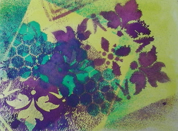
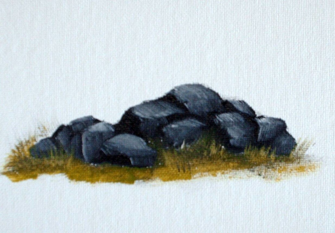
Here's an exercise that I use in my classes to help students loosen up. Set up a still life, a plant, a bowl of fruit, anything. Use only large brushes and work quickly. Set the timer for 30 minutes and GO! Also pay attention to how you can manipulate brush strokes to create, say a leaf, with just one stroke. If you do this once a week you will find yourself finishing faster as you gain more confidence and experience. As this happens, set your timer for less time. Have fun with it. It's just an exercise and can be easily painted over!

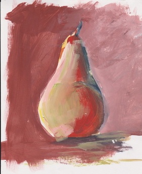
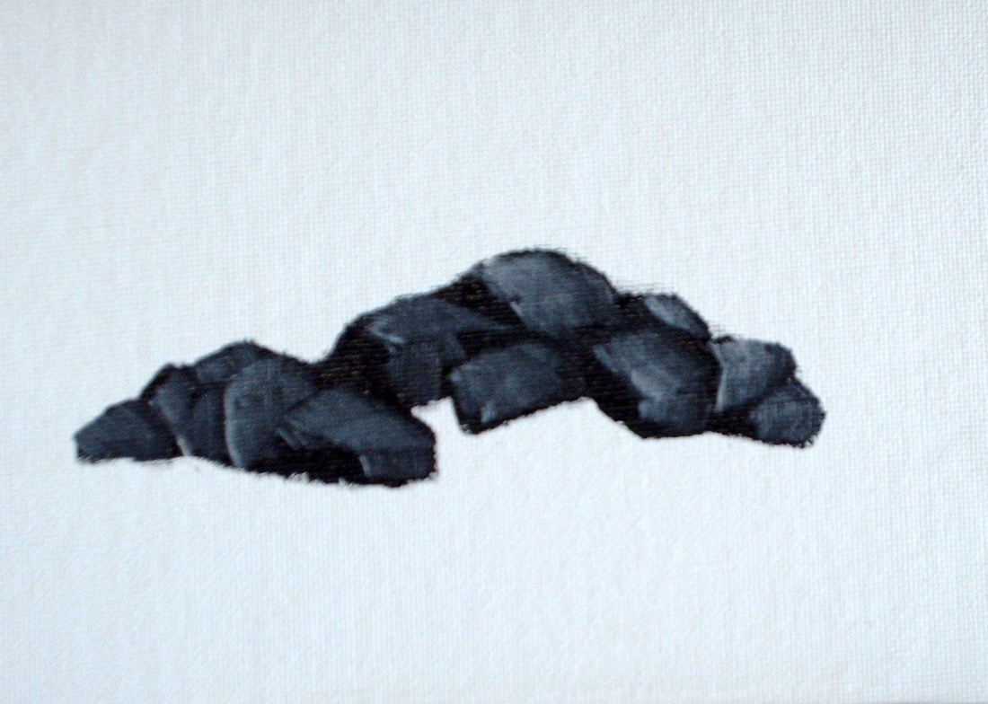
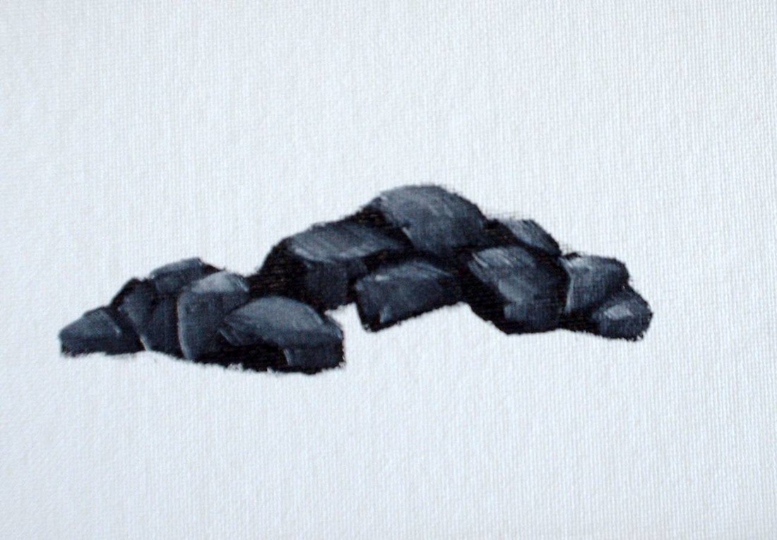
The pear was a really quick demo, I think about 5 minutes, but it will give you the idea of what we are going for in this exercise.

Picture
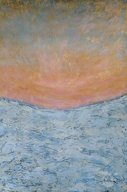
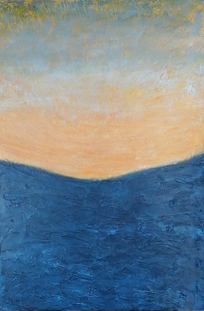
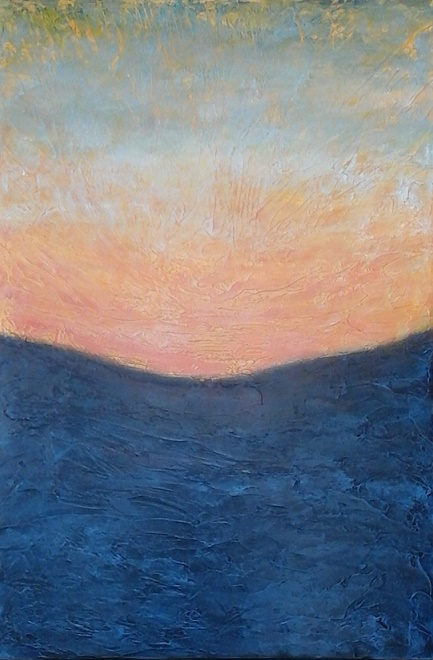
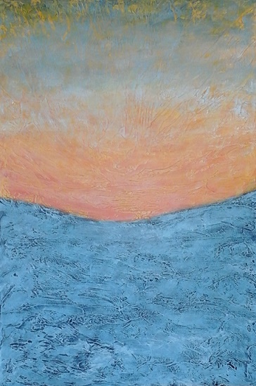
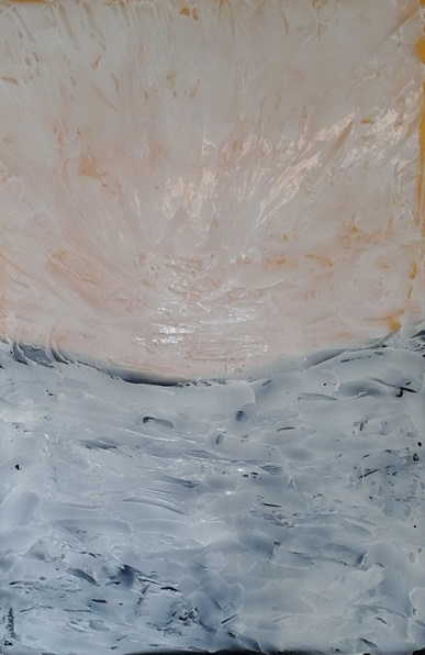
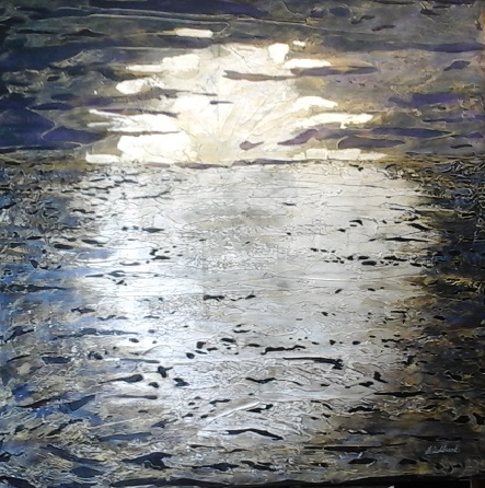
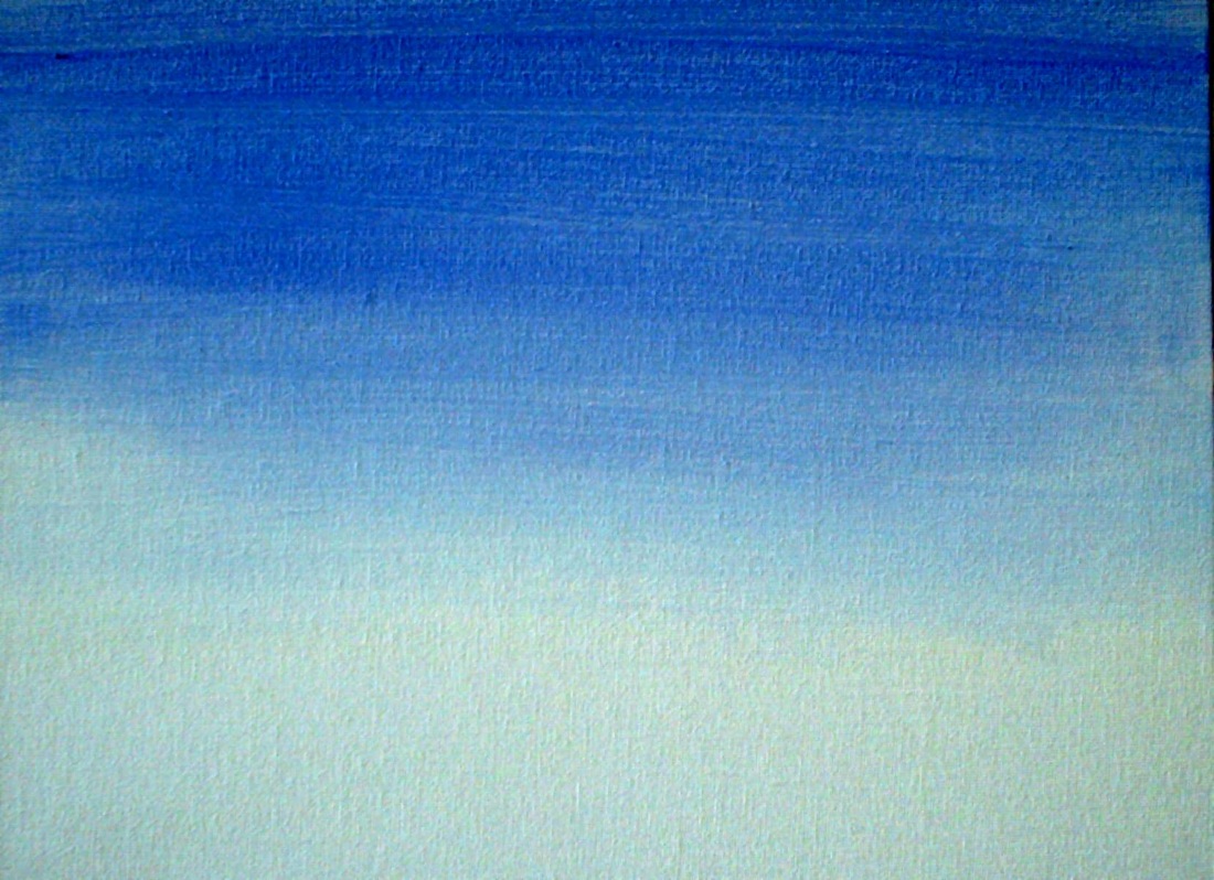
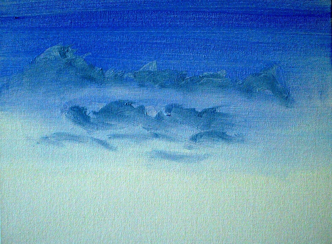
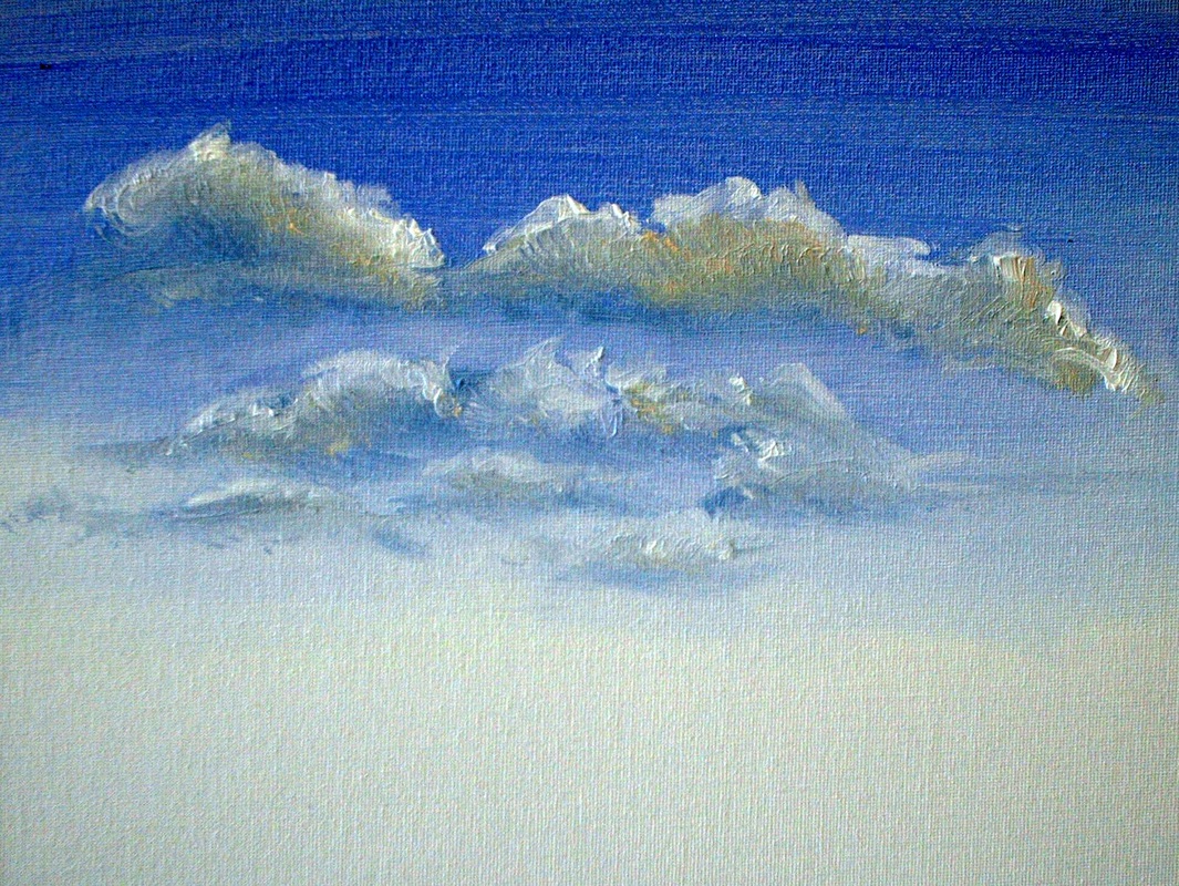
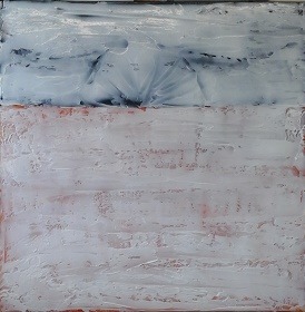
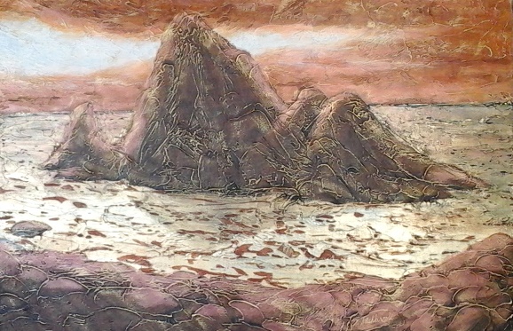
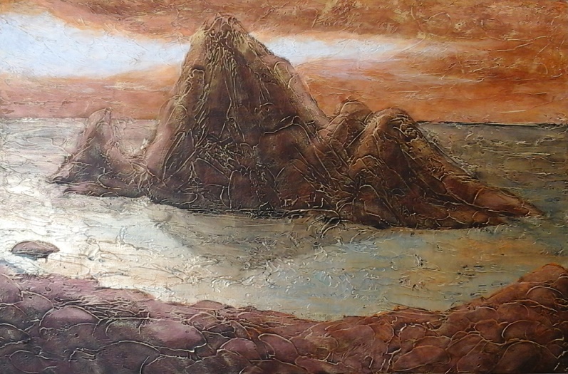
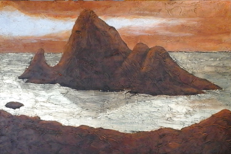
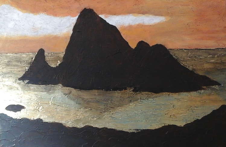
Painting Update: Dusk
This week I added more layers to the background. First was a layer of white for snow in the lower portion of the painting. Then in the top portion I added some Interference Red paint and some Interference Blue over the snow. This is a totally awesome paint, that actually has no pigment. The shimmery colour it adds to a painting is due to mica flake mixed into the binder. This paint shows more colour over dark paint backgrounds than lighter ones, but I love the ethereal feeling it gives to a painting... and with this product, less is more, so just a thin layer, otherwise it just looks like dirty white paint. 

After letting the interference paint dry I applied a light brushing of Iridescent Gold paint, by applying a thin layer to the fat side of a flat brush and just dragging it across the painting so that it catches the high points of the texture. This increases both the depth because of layering, and the shimmer because it is metallic. As with the interference paints the metallics usually have no added pigment.

I should point out that interference and metallic colours can be mixed with regular colour to create some interesting effects. Play with it, have some fun and be creative!

Next week the foreground will start to take shape.

Best wishes,
Susan

Picture
0 Comments

A video you really should see...

8/8/2015

0 Comments

 
I hope you enjoyed last week's guest blog by Michelle Casey. I certainly did! Attending her Vision Board Workshop, a few years ago, was a totally liberating and enjoyable experience for me. I hadn't finished my Vision Board during the workshop and that evening I worked well into the wee hours finishing it. It felt like my dreams were driving it's completion. My vision board now hangs in my studio and serves to inspire me regularly. I especially love the dream studio floor plan and architectural rendering of it. When I'm having a bad day I just sit and look at it and start to remember my dreams. It's better than a therapist and no where near as expensive!

Well, it seems like Summer has just arrived and here I am thinking all about Fall and setting up classes. Having lost some of my regular teaching venues because of changes in the way that they operate or closure of locations, I'm exploring new venues and business models. I will be offering more small classes at my studio, for three to five students. These offer a more personal learning experience and because class sizes are small, they are quick and easy to set up... so, if you want to get a few of your friends together for a certain subject or media, give me a call and we can set it up. If there are only one or two of you I can still try to set it up by letting other potentially interested students know so they can also register.

I'm also setting up more specialty workshops and workshops with visiting instructors. Currently I'm working on setting up two guest instructor workshops... one this fall and another next March. If you have any ideas or suggestions about classes, workshops or specific instructors that you would be interested in attending I would love to hear from you. Please send me a comment from my website or email me directly at mailto:ashbrookcreative@gmail.com. If there is enough interest I would be happy to set things up.  

Earlier this week a video splashed into my inbox and I find it so fascinating that I just have to keep watching it. It's about digital art software which is quite amazing, but it has really inspired me to see what I can create using inks in the same way that they use digital watercolour... using wet-in-wet and dripping techniques to enhance the original image. Take a look at it and see if it inspires you! Oh, and it absolutely the best viewed at full-screen! https://www.youtube.com/watch?v=HHEXBiH0TRU&et_mid=773717&rid=236234077


This Weeks Painting Tip:

Aerial (Atmospheric) Perspective
Aerial Perspective is a phrase coined by Leonardo da Vinci to describe a phenomenon caused in nature by the water vapour and dust in the atmosphere.  

He observed that the further things are away the more atmosphere there is between the eye and the objects, causing them to be more hazy and indistinct the farther away they are.

da Vinci concluded that:

Distance alters colour
• Colours become cooler and take on a bluish gray cast in the background
• Foreground colours appear bright and warm and are at their
   fullest intensity


Detail and contrast diminish in the background
• Darker forms become lighter
• Lighter forms become darker
• Contrasts between values become less towards the horizon


To apply Aerial Perspective think in terms of foreground, middle ground and background and paint what you see, not what you know. Aerial Perspective will allow for a greater perception of depth and distance in your paintings.

Aerial Perspective Exercise:
Paint a series of objects at an increasing distance from the eye, changing your tones and colours according to the observations of aerial perspective.

Picture
Painting update:

The three photos below are about the application of colour over the base colour coat, which you will remember, was Payne's Grey and metallic gold gesso. Then I added the gel texture medium. Once that was dry I applied a rough coat of Cerulean Blue Deep, a delectable deep green-blue colour, over the lower Payne's Grey portion and lightly over the gold gesso at the top of the painting. Then I applied a regular Cerulean Blue over that layer at the bottom as well as at the top, bringing the blue down and eventually adding more white to create the gradation of the sky... yes it is a landscape! Not only that, it's a landscape at that moment just before dusk when the sky has a magical glow.  By layering my colour and using the texture to my advantage, I was able to create the magic of that sky and added red as my last layer to the horizon drawing it up into the sky by catching it on the ridges of the texture.

The lower portion of the painting then got a rough coat of Cerulean Blue mixed with Titanium White, still letting portions of the Payne's Grey and Cerulean Blues show through. With a few more layers this will become snow. Aha, it's a winter landscape at that moment just before dusk!

Layers are the key to the way I work. Letting paint dry before applying another colour keeps the colours fresh and those blues and warm peachy colours that we see at sunset don't mingle to become mud! The texture also allows me to expose areas of all previous colours applied, which I like, and I find that each new layer requires less paint because of that. That said, I constantly seem to be waiting for paint to dry! Who said acrylics dry too fast? I beg to disagree!

Have a great week, be creative, and let me know what class and workshop subjects or instructors you would be interested in attending.

Thanks and best wishes,
Susan
Picture
Picture
Picture
0 Comments

Here's a real treat for you...

7/29/2015

2 Comments

 
Collage Your World's
Seven Easy Steps to Creating Your Own Vision Board


Susan invited me to talk to you about creating a vision board and I must say her timing is perfect. She has caught me red-handed procrastinating about making a new vision board for myself! Yes, even this instructor can be a huge procrastinator when it comes to making hers! I've been meaning to make one for a year and half now and just haven't roused up the enthusiasm.

You see I've suffered a number of great losses in the last couple of years... separating and divorcing my long-time partner, losing my house, various friends and family all in a short space of time and these things have taken their toll on my spirit. I found myself very disillusioned with life, so much so that I began to be too afraid to dream again.

In doing so I forgot how essential dreaming and imagining are to our lives. Author John Green has said: "If you don't imagine nothing ever happens at all." and this couldn't be more true. A vision board is just that; it's about imagining your dreams and making them real. As well as putting them front and centre in your life, so you don't forget them. If you believe that we only have one life to live, why not make it the best we have!

The first order of creating a vision board is to sit down and imagine what we want our lives to look like. My very first vision board was about beginning an art business as well as an art school. It's a big dream that is only possible to fulfill in small steps. Even though haven't fully realized it yet, since I began my vision board journey many amazing things have happened to me. I believe in its power so much so that I want to share it with others so everyone I know can grow and prosper.

I'll use my first vision board to acquaint you with the process of putting one together.

1) Ask yourself what aspect of your life you’d like to change? Do you want to acquire a healthier body, a new house, design a garden, embark on a new career, etc.? In my case it was to build an art business and later, school.

2) To envision what your board will look like, take 10 minutes to meditate to peaceful music while imagining your dream goal. Close your eyes and visualize this new world through your five senses (sight, sound, touch, taste, smell). Doing this allows you to build a more detailed vision of it on your board. In my case sight was very important. How my school and business were built and who inhabited their spaces were important. There are a mixture of spaces: old, modern and contemporary on my board .... places to contemplate, make and enjoy diverse forms of art. There are mixtures of people: old, young, professionals, lay people and people of different ethnicities who I hope to engage in this endeavour.

3) After meditating, take at least 10-15 minutes to jot down the types of images and words that came to mind while you were imagining your goal. Throughout the process, when you get stuck, these notes will help you focus.

There were concepts in my vision that I wanted to capture so I did these through choosing words I found in magazines... "shelter", "passion", "tranquility" and "journey" were concepts that were important to that world.

4) Search for your images and words in: magazines, books, photo albums, flyers and poetry/quote books; even the Internet.

5) Spend a few hours cutting out your materials and arranging them in a manner you see fit. I have a few simple collage layout styles I introduce to students as a guide. Depending on how big a surface you use and how much material you have, it may take you 1-3 hours to glue. You can also add: paint, pencil crayons, glitter, stickers, fabric, etc.. to add further texture and interest to your board.... really make it you!

Because it's relatively simple, I like to use a grid style arrangement of images on my board (see image below); it's composed of mostly squares and rectangles that butt up together in linear grid format. I use illustration board for my board surface because it's sturdy and won't warp as much with liquid glues or paints. There are a variety of methods to "glue" things on your board. For fun ideas see my blog: "There Must be 50 Ways to Glue Your Collage" cited below. There are many other ways to present a vision board besides on an  illustration board. Feel free to visit my Pinterest page (see below) for other vision board formats.

6) When finished, place your vision board in a room where you can contemplate on it for a few minutes every day... perhaps your bedroom or kitchen; mine is in my studio.

7) Share your piece with like-minded friends. They may be able to give you tips on how to achieve your dream goal. The ideas and support of friends and strangers has been invaluable in helping me achieve my dreams -- ah, the power of word-of-mouth!

If you decide to take up the vision board challenge, I’d love to hear how you felt about the process. If you’ve got more questions about the steps, feel free to email me. I’d be glad to give you more details. As well, see the links below to find out more about my motivations behind making my first vision board and other tips to make yours. If you'd like to take my next vision board workshop, please check my Workshops Page (http://www.collageyourworld.com/workshops.htm) periodically. My next couple will be in the fall.

Susan, many thanks for giving me this opportunity to spread the word and for giving me that swift kick I needed to get my act together again. Hugs!

Other Links:

Collage Your World: There Must be 50 Ways to Glue Your Collage
http://www.collageyourworld.com/blog/?p=187

Michelle Casey Pinterest Vision Board Samples
https://www.pinterest.com/mmmcasey/vision-boards/

Collage Your World: The Call of the Vision Board
http://www.collageyourworld.com/blog/?p=7218

The Right-Brain Business Plan: Michelle Casey's Vision Board
http://www.rightbrainbusinessplan.com/2010/06/28/spotlight-on-michelle-casey-of-collage-your-world/


Michelle's Vision Board

Picture
Susan's Vision Board
The result of one of Michelle's Vision Board workshops. It was a ton of fun and a very inspiring experience. Thanks Michelle!
Picture
2 Comments

Well, it really had to be done...

7/16/2015

0 Comments

 
Or as Popeye would say, "I've had all I can stands, and I can't stands no more!"  Then he'd pop open a can of spinach, down it and get busy!

Well, I passed on the can of spinach... maybe later, thanks... but I did get busy.

Over the last year I've started feeling as though the studio walls were slowly creeping in on me. There is so much stuff stored in my studio that there is almost no room to work.  One corner has 30+ finished paintings on gallery canvasses (the thick ones); then there are all the blank canvasses lined up, patiently waiting for their turn to show off their beauty; easels in another spot, in addition to the big one that I usually use; rolling suitcases that I use for transporting art supplies to classes taking up more floor space; and piles of new art tools that have never even had a home... just put on the table to sort out later.

Finally, with having no space to lay my recent large paintings flat to varnish and wire, I decided that the time to deal with it was NOW, and I got busy. Although there is still lots to do, I now have two bare work tables on which to lay my large pieces. Paint jars are back on their shelves, brushes are back in their appropriate coffee cans, oh, and the box of brayers that I haven't been able to find for ages, I found it in the strangest place: where it was supposed to be on the shelf! Imagine that!

I now have a room in my basement that, with a few modifications, will become a store room for those 30+ finished paintings and canvasses-in-waiting, which will free up a lot of room in the studio, making it a much more creative space, and I did it all while waiting for paint to dry!

The art exhibition for the students at the Cumberland Lodge was this past Sunday and even though there were not a lot of pieces of artwork we had a great time. The students were thrilled to see their work framed and hanging on the office divider screens we used. You could just see it in their faces when they came in! Cheryl also put together bio's for each of the exhibitors and some also brought other art or crafts to display on their panel. Poet, Brenda, who is a resident, was on hand to do a book signing of her two published poetry books. Refreshments were provided by the Lodge and there were some amazing looking cupcakes, which I had to resist... oh, but they looked absolutely scrumptious!

Phil, one of the very generous donors of the art supplies for this course was also in attendance and it turns out that he is a talented artist himself, even having only taken up painting recently. We also had a visit from Diane, an artist that lives just down the road from the Lodge who came in to show us a painting that she had been doing of her amazing log home for a wedding gift for her son. The residents of the Lodge had regularly stopped by, on their walks, to see what progress she had made on the painting. They were thrilled to see it finally completed.

During the various conversations the idea of a Christmas Craft Bazaar came up and the talk, it seems, has been ongoing. I have agreed to conduct some workshops on Christmas ornaments etc, for residents to make, either for the bazaar or as gifts. This should be a lot of fun as there are some very talented residents and they are always enthusiastic about learning and doing new things! What a treat it has been working with them!

This Week's Painting Tip: Stencilling
One of the techniques we used to create journal pages at the Lodge was stencilling with spray inks and distress stains.

Here's the process we used:

  1. Create a light coloured background using the distress stain dauber to spread some on your paper and then using a wet-nap to spread it all over the page evenly. Ideally you should let that dry or encourage it with a hair dryer.
  2. Then lay a stencil over the background and spray it with the ink. Lift the stencil carefully.
  3. Again let dry before you apply more.
You can also turn the stencil over and apply the wet side to the page to create some interesting effects.

Another trick is a subtractive technique where you lay the stencil over a wet background and apply a clean dry paper towel over the stencil to lift the colour where the stencil is open.

Stencils can also be used to add texture to a mixed media piece by spreading a wide range of acrylic texture mediums or high viscosity/heavy body paint over the stencil with a palette knife and then lifting the stencil off carefully.

You can also create your own stencils by cutting them out of  plastic stencil sheets available at craft stores, or a sheet of acetate.

When purchasing stencils the design is always the most important thing, but pay attention to whether it will give a positive or negative image when used and also, you need to be aware of the durability of your stencil. Some of the first ones I bought were flimsy acetate sheets which barely survived their first use. Nowadays I see that the stencils seem to be more durable, but, non the less, it's something to watch for.

And, this week I came across a video on YouTube, produced by Lindsay Weirich, thefrugalcrafter explaining how to create stencils with a hot glue gun and a silicone baking sheet. Perfect for creating custom stencils! If you are into mixed media or journalling you should check it out at https://www.youtube.com/watch?v=YbLcxJ0RYQQ
. Enjoy!


Below is a quick demo of stencilling with the inks. The bleeding can be eliminated by letting the inks dry between layers.
Picture
Dusk: The New Painting   

  With the painting from Jane's Photograph and Quiet Reflections finished, except for varnishing... which I can now do, I have started a new painting. This one is a little different from the last two as I'm not using metal leaf, and it will be done in multiple intertwined layers instead of simple layers.   To start I sketched out my design on the canvas with a light gray soft pastel pencil, which easily wipes off with a cloth or disappears when you paint over it. I just wanted to sort out the composition in my mind as I am working from several different photographs to create this painting.   Once I decided where things would go I blocked in my lower area with Payne's Grey and put two coats of gold gesso over the upper half. I'm hoping the gold gesso will maintain some of the luminosity that the leaf offers but not as strong as the leaf.   When that was dry I spread my gloss gel medium over the whole canvas and created the texture, keeping in mind what would be going in the various areas of the painting. Remember, there will be several layers of texture to build the painting up to it's finished level. Now I wait for that to dry... usually ready to work on the following day, unless of course it's raining in which case it can take several days. This painting will also have some fun finishing techniques that I think you will enjoy, so stay tuned!

Best wishes,
Susan

Picture
Picture
0 Comments

I just learned something I didn't know about Robins!

7/8/2015

2 Comments

 
Tuesday morning I had a dentist appointment and upon my return home I found a baby Robin parked on my front porch. He was obviously missing his parents and called out to them every few seconds, but they were nowhere to be seen.

Then the chipmunk, who normally torments my cat, Morgan, at the patio door, came whipping around the corner of the house, stopped, sniffed the chick and went on his way to the studio... to critique the artwork, and then to over to my neighbour who feeds all the chippies! Oh what a complex community this is... I should write a book!

So, the young Robin left the porch and settled into the grass, still calling, and I went inside. I could still hear him calling and after a while went outside to check on him. He seemed fine but I was concerned: had he been orphaned, abandoned, or lost? I just didn't know what to do about him, and since he was on my front lawn I felt responsible for him.

Then I remembered the Wild Bird Care Centre out on Moodie Drive in the city's west end. I called them and talked to a very knowledgeable young lady who told me that young Robins leave the nest about a week before they can fly. They live on the ground and in the bushes, with their parents close enough at hand to watch over them, but far enough away to teach them independence... an internship, so to speak. She said that as long as he was alert and active that I should do nothing. If he becomes lethargic, unresponsive or very uncoordinated then I should bring him to them and they would care for him.

While I was on the phone with the young lady, an adult Robin arrived and was digging for worms or bugs on the other side of the road. This was not missed by young master Robin who began heading across the road in such a fury that he kept falling on his face.  With an apparent resolution inevitable I went back to work in my office.

A while later I had to go to the Post Office and was looking to see if I could see the chick before backing my car out of the driveway. My neighbour, the one that feeds all the chippies, was out so I told him about the baby Robin. While we were talking we noticed an adult Robin landing on the curling club lawn across the road, and then we could see the chick being fed by the adult.

So all's well that ends well... and I didn't have to drive to the other side of Ottawa to deliver young master Robin to the Wild Bird Care Centre.

Summer art classes
 The Acrylic and Oil class at NECTAR (255 MacKay Street in Ottawa) is running this summer from July 9 to August 27, and drop-in students are welcome to attend. The drop-in fee is $20 per class and is open to all media and styles of art. Bring your art, your materials, tools and your questions or concerns about what you are working on. I will help you resolve your issues and move to the next level.

Today's Painting Tip: Painting Red
 Red is an interesting colour to work with. If you lighten it with white it becomes pink, but what if you really wanted a light red instead?  Alternately, if you wanted to darken red would you add black and end up with a muddy red rather than a rich dark red?
Here's a couple of tricks to try:
Lighten a red by adding white and also some orange to counteract the pink effect. 
 When darkening red use it's compliment, green, and add a bit of purple to give it some life.  

Try it by painting the red ball below, and let me know if it helps... or let me know what your favourite red mixes are.


Picture
Next Painting
After bringing you up to date on the painting I put on Face book as it progressed, I have taken the lessons learned from the painting of Jane's Photograph, and applied them to the first piece. Initially I found the painting rather bland, not much definition and while it did reflect what I wanted to show you, it was not pleasing to me. I have added some clouds to the sky, over the sun; more sun; and some ripples in the water. Here is the result, with which I am much happier. 

Next week a new painting begins!

Best wishes,
Susan

Picture
2 Comments

Let the Summer Roll Out!

7/2/2015

0 Comments

 
Remember Those Lazy - Hazy - Crazy Days of Summer?  The song that was immortalized in a 1963 album by the Late Great Nat King Cole. (https://www.youtube.com/watch?v=7OZrNDtRltg) Well haven't things changed since then? No lazy, hazy for us art types, although it does get a bit crazy sometimes.

A lot of my classes obviously don't run during the summer, however I like to keep my hand in, so to speak, and offer my most popular class (Acrylics & Oils) as well as some one-day workshops. It's also a time of year that I want to be working in the studio, with the door open and the chipmunks popping in regularly to offer their critiques. You should hear some of the things they say! Oh my!

This summer I'm offering:
Acrylic & Oil Painting
other media (pastels, watercolour, mixed media etc) are also welcome
Thursdays, July 9 to August  27 (8 weeks)
1:00 to 3:30 PM
Drop in Fee: $20/class Please let me know if you plan to be a drop in student... it makes a difference whether the class runs or not. Thank you!

Plein Air Painting
Wednesday, July 15, 2015
9:30 AM to 3:30 PM
Fee: $95

Alternate Painting Surfaces
Saturday, July 25, 2015
9:30 AM to 3:30 PM
Fee: $145 (Includes alternate surface materials and workbook)


Colour Mixing, the School of Colour Way
Tuesday, July 28, 2015
9:30 AM to 3:30 PM
Fee: $115 (Includes extensive workbook and exercise sheets)

Colour Harmony and Contrast, the School of Colour Way
Saturday, August 8, 2015
9:30 AM to 3:30 PM
Fee: $115 (Includes extensive workbook and exercise sheets)

Silk Scarf Workshop
Tuesday, August 11, 2015
9:30 AM to 12:00 PM
Fee: $65 (All materials supplied)

Developing an Artistic Journal
Saturday, August 22, 2015
9:30 AM to 12:00 PM
Fee: $60 (Materials list at registration.)

All courses will be held at the NECTAR Centre at 255 MacKay Street in Ottawa.

For more information: http://www.susanashbrook.com/summer-workshops--classes.html or contact me directly at 613-833-8312 or mailto:ashbrookcreative@gmail.com.


Also this week I've been talking with two premiere artist/teachers about setting up some workshops later this year and next. One is a well known Canadian artist who paints in acrylics and the other is a Certified Botanical Illustrator from the US who works in a variety of media.

I really enjoy setting up workshops with guest instructors, so if there are subjects, media or even artists that you would like to have workshops with, please by all means let me know... if there is enough interest I'll set it up!

So, no lazy, hazy around here... this summer is going to be busy! So let's get it  rolling!

Today's Painting Tip: Painting Clouds
First get your sky in, remembering that the sky is lighter and cooler toward the horizon. A quick and easy way to do this is to cover your sky area with Titanium White and then start at the top of the painting with a line of Ultramarine Blue and blend it down into the white. If you need to add more blue start at the top again so that you maintain the proper gradient as you move toward the horizon.

Next mix a light gray with a touch of purple to warm it up and apply it randomly across the sky where you want the clouds to be. Soften the bottom edges of the clouds so that they blend into the sky. Clouds appear smaller the closer they get to the horizon.  The purple adds life to the gray of the clouds and without it they will look dull and flat.

Now mix a warm colour using white with a touch of yellow or yellow ochre and apply this on the upper part of the clouds you have already painted, blending the colour into the purple/gray colour. Finally, apply pure white at the top of the clouds, blending into the yellow colour. You can also leave some pure white harder edges at the top.

When painting clouds take some time to think about what they are... water vapour, rather than cotton balls. If your clouds look too much like cotton balls try softening some of the edges to that they blend into the sky. With clouds the light source (the sun) is above them so the shadows will be on the underside and the highlights on the top... simple observations that can really help.

The Next Painting
Now that the painting from Jane's photograph is finished, I've gone back to the first one I did in this series, that I posted on Facebook. As is often the case, the first one is a test and the second one gives the real lessons. Well I've taken those lessons and am applying them to the first one "Reflections". Today I'll bring you up to date on where we left off on Facebook. Next week you will see what I learned from doing Jane's Photograph.

By the way, if you wish to comment or suggest workshops please go to http://www.susanashbrook.com/blog where you can comment or subscribe.

Thanks and best wishes,
 Susan

0 Comments

Happy Summer!

6/24/2015

0 Comments

 
You can subscribe to receive my blog regularly by email by using the subscribe box on the lower right hand side of the blog page at www.susanashbrook.com/blog. If you choose to subscribe you will receive a message from feedburner to confirm your subscription. It is totally safe to do so, and of course, you may unsubscribe at any time.

Well, it's here... we've waited for many, many months, gone through a long and cruel Winter, an "interesting" Spring and, guess what? It's finally Summer... we actually made it!

As a child, I remember the countdown to the end of school and waking up on the first day of summer holidays feeling like the weight of the world had been lifted from my shoulders. It was a joyous feeling of absolute and unconditional freedom! For those of you closer to my age... do you remember this?

No more pencils
No more books
No more teacher’s
Dirty looks.


As an adult I lament the loss of that feeling. Currently I am counting down the days because there are deadlines to meet and things that need to be done. Organizing, promoting and preparing for Summer classes and workshops; preparing for new classes at area retirement residences; looking after registration details and payments for fall events; making arrangements for Fall classes and workshops. Whew! And that's not to mention that I want to get out to the studio and paint all those paintings that are burning a hole in my brain!

I must admit that writing this blog has had the unexpected but very pleasant consequence of getting me into the studio on a regular basis to do the painting update for each post, and of course, once in the creative space other stuff just starts to happen... can't be stopped!

My students at the Cumberland Lodge are starting to get really excited about their upcoming art exhibition on Sunday, July 12, from 1:00 to 3:00 PM. The Lodge is at 2564 Market Street in Cumberland Village and you are invited to stop by if you are in the neighbourhood. The artists would love to see you and tell you about their work. It's been a truly amazing experience for me. These people, with the various disabilities and limitations that they have, have produced some awesome works of art!

In addition to the artists, the Lodge's resident poet, Brenda Rose will be on hand to sign copies of both of her published books...  she too is very talented!  I hope you will take the time to join us for a great creative experience and refreshments.

Today's Painting Tip: Creating Abstract Art
 Expressive, or intuitive abstract allows the image to be generated from inner feelings and emotions. The artist slaps on or spreads the paint based on what they are feeling at the time. While it's great therapy it does not always generate great art.

Abstracting reality works by removing detail, depth, shadow and perspective. Simplify shapes and change the colours. Reduce the painting to basic shapes and lines.

Close-up of Reality... The closer you get to something the less recognizable it becomes. When it is no longer obvious as to what it is, we begin to see it as pure design

You can also generate basic designs on your computer using "autoshapes" provided with some software to block in areas, shapes and colours etc, to get you started or help solidify your ideas.

Update on the Painting from Jane's Photograph:


The painting is finished and I'm very pleased with it! After last weeks work I added some burnt sienna and Payne's gray to the texture in the water, to create the reflection of colour from the rocks. It gives the painting some definition. I'm also loving the effect of the gold leaf in the painting, it's brilliant!

I have applied an isolation layer of liquid medium to protect the paint from the varnish, which will be applied in a few days, after the isolation layer has cured.

What's next? Well, lot's actually... paintings already in progress and some new ones that I'm really excited about.  Please stay tuned!


Thanks and best wishes,
Susan

Picture
0 Comments

Goal-Gradient

6/18/2015

0 Comments

 
You can subscribe to receive my blog regularly by email by using the subscribe box on the lower right hand side. If you choose to subscribe you will receive a message from feedburner to confirm your subscription. It is totally safe to do so, and of course, you may unsubscribe at any time.

The hypothesis of goal-gradient is based on animals... [R]ats in a maze … run faster as they near the food box than at the beginning of the path. —Hull (1934), and applied to people working towards a goal or completion of an assignment.  The closer one gets  to one's goal the more focussed one becomes on achieving it.

For an artist that could be finishing a painting, setting up an exhibition or even entering a competition. Oh, by the way, I'm not suggesting that artists are like rats...  unless of course you self-identify at a rat, but artists are like everyone else who want the goal completed, and completion becomes the dangling carrot to making it so.

All that to say that I spent the afternoon, yesterday, in the studio finishing a couple of paintings... totally focussed on my work. As an artist this is a wonderful sensation... to work freely and unfettered by other responsibilities;  to allow the Muse to have the upper hand;  to let the laundry lay in it's sorted piles until another day (laundry is very patient and will wait for as long as it takes, but it does seem to multiply while lying there!). Oh, and I completely forget about writing a blog post until I finished painting... so now I'm a day behind.

This past weekend I attended the Westboro Village (a neighbourhood in Ottawa) Westfest and found an unbelievable bargain on pre-made frames from Wall Space Gallery (http://www.wallspacegallery.ca/). The frames had been on other paintings, but to get a 24" x 36" floating frame for a gallery canvas, in excellent shape, for $5? No-brainer!!! Just heavy carrying it back to the car, some 10 blocks away!

The art exhibition at Wall Space Gallery was also amazing. They featured three fabulous artists and also had pottery and jewelry by very talented artisans. If you get to Westboro this is a must see gallery! Just tell them that Susan sent you!

Westfest also gave me an opportunity to visit with my sister Valerie, at her store, The Cuckoo's Nest (http://www.thecuckoosnest.ca/), to decide on the final pen and ink image of the old Westboro Town Hall for her custom "Westboro Village" coasters. I must say, the coasters are not what I thought they would be, but a much higher quality product, being made from polished Canadian shield granite. These are definitely a great gift giving item!

Today, now Thursday, was the last of my Spring class sessions. It's always a bit sad when I hear "See you in September" at this time of year. But, I am offering a number of workshops this summer as well as my ongoing Acrylics and Oils class at NECTAR in New Edinburgh. For more information check out the classes/workshop segment of my website, or contact me for information. I also have openings for private or small group classes at my studio, so let me know if you are looking for something not listed.

For fall classes and workshops I am open to suggestions about kind of classes or workshops you would like to attend, so please let me know. Even if it's something I don't teach I can arrange workshops with guest instructors on many subjects, media or styles, if there is enough interest. I even know a terrific sewing/knitting teacher if that is your interest. I look forward to hearing from you!

Today's Painting Tip: Painting Rocks

Rocks are simple to paint if you just let them happen, rather than trying to duplicate the rocks in your photo.

Start with your darkest rock colour and just apply it in a random fashion similar to the rocks you want to paint... angular or round, large or small etc. Then create the different facets of the rock with a lighter colour. Add highlights with the lightest colour, considering where the source of light is. Finally, you can add some highlights of reflected light on the dark side of the rocks. This is usually done in the colour of the sky as that is most often what is reflected. Don’t forget to “anchor” the rock with shadows and foliage around the base.

I recommend a minimum of three shades of the rock colour... dark, medium and light, however you can do as many values as you like but three will give your rocks the form you need to be realistic.

By starting with the darkest rock colour your shadowed crevices will appear to be exactly that... crevices, as opposed to putting the cracks in later, which will give them a painted on appearance.

Okay, so get rockin!

Update on the Painting from Jane's Photograph:

This week I refined the colours a little bit to enhance the effects of the late day light, applied interference orange over certain areas of the painting  to create an ethereal element and then enhanced the texture by using Iridescent Gold metallic paint, brushed on lightly with a large flat brush held almost parallel to the surface of the canvas.

The interference colours and iridescent metallic paints have no pigment in them... with the exception of Golden's Iridescent Bronze, which has Phthalo blue added to tone the colour down to a true bronze colour. These paints are created using mica flakes that when mixed with the polymer binder create the metallic colours. They handle a little differently than regular pigmented paints, but offer incredible opportunities to enhance your artwork. Let me know if you want to know more about these wonderful paints.

Also, next week you will see the Painting from Jane's Photograph finally finished!

Best wishes,
Susan

Picture
0 Comments

A Brush With Greatness!

6/10/2015

2 Comments

 
(Please click on the title to go to the blog site to leave comments or subscribe.)

As brushes go, there are all manner of shapes, materials and qualities, so finding what's great for you can be a trial and error game. Let's see if we can find an easier way to play!

First, what medium are you working with? Will you be using the brushes to paint, apply glue or brush metal leaf off a surface?

Watercolour Brushes tend to be soft and are available in a variety of natural hairs and synthetic bristles. The most prized watercolour brushes are made with "sable" hair, Kolinsky being one of the most popular.  These are made from the tail hairs of the male Siberian weasel's winter coat. Because the weasel does not do well in captivity they are trapped and killed for their tail hairs. I'll let you decide where you stand on that one. Other natural hairs include squirrel and camel hair, neither of which maintain a fine point for detail and they are generally considered to be children's brushes. There are some wonderful synthetic watercolour brushes on the market, though, that replicate the qualities of sable brushes, are easier to maintain and are much more budget conscious.

Oil Brushes are usually stiffer and often made of Boar bristles (hair). The stiffness of the brush allows the artist greater control over the thicker oil paint and also leaves the brush strokes that we associate with oil painting. Because they are cleaned with solvents, instead of water, and used with oils the natural bristle tends to maintain it's spring and doesn't degrade as quickly as brushes that are constantly used with water, but you can never get a real sharp point on  a round or create a fine line with a flat on it's edge like you can with the synthetic brush. Synthetic oil brushes are usually stiffer than synthetic watercolour brushes.

Acrylic Brushes are generally synthetic because natural hair brushes don't stand up to the water and mediums as well, breaking down faster. Synthetic brushes also allow the paint to slide off the brush onto the canvas or paper, where natural hair brushes tend to clog with quickly drying acrylics. When working in acrylics you can use synthetic watercolour brushes (soft and short handled) or synthetic oil brushes (stiffer and long handled) and of course there is a range of stiff nesses in between the two.

Multi-purpose brush uses that include blending pastels and brushing metal leaf off a painting surface are generally stiffer than watercolour brushes and natural or synthetic fibres both work well.

Shapes of Brushes

Flat: This brush is flat and wide with a square tip. It is generally used for blocking in and applying colour generously as it holds a good load of paint. You can paint bold strokes with the flat side and finer lines with the edge.

Bright: A bright brush is basically a flat with shorter bristles.

Round: As it’s name implies, a round is round. These are generally used for details and painting lines. 

Fan: The fan brush is flat. It is used for smoothing, blending and creating things like trees, shrubs, grass, fur and other special effects.

Filberts are a member of the flat brush family but instead of a square tip they have an oval one. This makes them useful for blending as well as daubing in foliage and creating soft edges on clouds. The side can also be used to create thinner lines. These are often a favourite of landscape painters.

Rigger/Signature: These are fine, long bristled brushes that, because of the length, hold a good load of paint. They are used for fine lines and writing signatures. They get their name because they were traditionally used to paint rigging in maritime paintings.

House Painters brush: A good quality painters brush can be a big help when painting large canvasses. It’s a larger version of the artist’s flat or angle brush. These brushes also hold a lot of paint so be prepared to use lots of your colours!

Angle brushes: These brushes are handy for getting into corners, much like the house painters cutting brushes. You can also use them as you would a flat or bright. 

Comb brushes: The bristles at the tip of these brushes are thinned out compared to the lower portion of the bristles. This allows the brush to be loaded with sufficient paint but to apply it more sparsely. Use the comb to create grass or fur effects.

Dagger brushes are soft and flexible and shaped like a dagger... one edge straight ad the other edge curved. They are wonderful for creating lines of varying thickness, as in lettering or decorative work. You should use fairly thin paint to take advantage of this unique brush.

Deerfoot brushes: These brushes began their lives as rounds and then got chopped off at the end. They are terrific brushes for creating leaves, shrubs and anything else that has a repetitive round or oval pattern. Use by holding the brush fairly upright.

Shapers: Paint shapers look like brushes but are made of rubber/silicone. They come in a variety of shapes and sizes and allow the artist to remove or shift paint to create effects that cannot be achieved with regular  paint brushes. 

Stencil brushes: Anyone who is familiar with stencilling will recognize the stippled effect that these brushes provide. The brushes are loaded with paint, tamped on a paper towel or rag to create a “drybrush” situation and then applied at a 90' angle to the painting surface. The resulting mottled effect can create the appearance of plaster, soften edges and assist in the blending process.

Tooth brushes: Spattering allows the artist to create snow scenes, add texture to rock faces, develop backgrounds and blend colours in a painting. Old toothbrushes are perfect for this, creating spatter by using the thumb, or by rubbing the brush, ladened with paint, over a piece of wire mesh. 

Sponges are great for creating the suggestion of  bushes and trees, rock faces and anything with texture. Sea sponges work best because of their naturally random patterns. When using sponges it is always a good idea to change the direction of imprinting to help maintain that natural effect. To build a natural layered effect start with the darkest colour and gradually work to the lightest colour.

Brush handles are always handy to create texture, lines and designs in your wet paint. Alternately you might use a notched mortar trowel, or anything else hard to create textures and patterns. 

Fingers: Get right into your work of art by manipulating it with your fingers. Fingers work well as a blending tool, an eraser, a paint applier, and when you use your whole hand, a schmoosher! 

Natural Materials: Think outside the art store! Use pine needles, a cedar branch, flowers and seed heads, feathers, sticks, moss, leaves… whatever you can find that makes interesting marks.

Old Brushes: Never throw out an old ruined brush, because even those have their greatness for creating textures, special effects and things you would never use your good brushes for!

Today's Painting Tip:
When painting with acrylics use a liquid/polymer medium to thin your paint, not water! If you thin your paint with too much water you can break down the bonding process of the polymer binder and when your paint is dry the pigment will easily brush off your painting surface. The medium is made from the same polymer binder as your paint, so you can thin your paint as much as you want and the polymers integrity will still be maintained. I like to thin my polymer medium with 25% water. This way I still maintain the integrity of the medium and the paint but it handles much more like water. By the way, you can thin any acrylic product with up to 25% water with no problems, otherwise, water is only for washing brushes!

Update on the Painting of Jane's Photograph:
In today's photo I have taken the painting beyond the flat colours of the last stage by adding lighter colours to the rocks. I've worked from Burnt Umber, to Burnt Sienna to Burnt Sienna mixed with some Cadmium Yellow and then used Cadmium Orange to highlight the shapes of the rocks and show the sunlight on the edges. I have also refined the sky. The texture that was applied with the gel medium is now starting to be enhanced with the layers of paint. Getting close to being finished... I'm getting excited!

Best wishes,
Susan

Picture
2 Comments

Uh, oh! Writer's Block!

6/5/2015

6 Comments

 
(Please click on the title to go to the blog site to leave comments or subscribe.)

Okay, so I'm sitting here at my desk looking at a blank screen with a blank mind and wondering what to write about this week. I've scrolled through the list of lessons on my computer, but nothing is speaking to me. Nothing is jumping up and down yelling "Pick me! Pick me!" Drat! Then it hit me... creative blocks, and not the ones you stack to build castles! We'll play with those another day!

What causes creative blocks? Well, it could be any manner of things... coming down with a cold; pain; worrying about something; lack of good sleep; fear of not being creative; self-doubt about your abilities to get a painting the way you want it... it could be anything, but the result is always the same... nothing gets accomplished.

Far, far away, in another life, I worked as a commercial artist, or as they are called today,  graphic designer. In the design industry the rule of thumb is Be Creative, or Be Fired! One quickly learns to develop an arsenal of tricks to defeat creative blocks.

Here are some tricks that artists I know use:
For some people getting together with another artist and comparing notes or paintings over coffee helps. People who have been away from art for a while often find taking a short workshop helps to get them back on track, and often a workshop in a different medium or technique will fire up the creative furnaces.

There are things like doing a tour of local galleries, or a studio tour, to see what's new and exciting; attending product demonstrations at art supply stores; attending artists conferences; joining an organization of artists; trying one of those colouring books based on Zendoodling.

You can also set yourself a goal of producing one piece of art each week, or day or month or per class, and while it may be hard to keep going in the beginning, it will become easier and become a good creative habit after a while.

Did you know that it only takes 28 days for a new habit to become natural and part of your life?  So why not do a quick 15 minute sketch everyday? Your skills will improve just from doing it, and your creativity will become available everyday.

The one thing I find most effective is to go out to my studio, not to paint, but to tidy up or organize things. It doesn't take me long to start messing with the materials instead of tidying, and pretty soon I'm right back into making art!

Another thing I do is always play music when I'm in the studio, whether I'm tidying or painting. It is the white background noise that eliminates the sound of cars driving by or the ferry running back and forth across the river. I am not conscious of the music while I'm working, but it does help get me into that creative right brain mode, yet I seriously miss the music if it's not playing when I'm in the studio.

Please let me know how you deal with creative blocks. By commenting on the blog site, you will be able to share your experience with others. Thank you so much!

For creativity inspiring activities... this event is coming up and I recommend it:
Orleans Art Studio Tour / Tournée des ateliers d'art d'Orléans
June 13 & 14, 2015 from 10 AM to 4 PM.
Please join the artists at their opening reception on Wednesday June 10th, 7:00–9:00 p.m. at Wall Space Gallery, 2316 St. Joseph Blvd in Orleans.
For more information: http://www.oast.ca/

Also, coming in July, Michelle Casey, Canadian collage artist, will be doing a guest blog. I'm really looking forward to this as Michelle does amazing work and is going to share some of her highly successful techniques with us.  

Today's Painting Tip:
Just paint! It doesn't matter if it's good or bad, just get something on paper, canvas or other surface. Express your creativity to keep it going! Do some quick sketches with any artistic medium. Cut images out of magazines and make a collage. Don't take it all to seriously. There is more to art than "rules", so explore and experiment! And, above all, have fun!

Update on the Painting of Jane's Photograph:
I've started adding colour to the painting, building the sky, the rocks and the water.  The sky and rocks start as many of my paintings do... with the darks laid in first. These will lighten as subsequent layers are added. The colour in the water, to maintain the metallic beauty of the gold leaf, is applied in thin layers. Those who have taken my glazing workshops will appreciate the applied use of this technique in conjunction with the gold leaf.

Best wishes,
Susan

Picture
6 Comments
<<Previous
Forward>>

    Susan Ashbrook

    I enjoy sharing my knowledge with other people. I teach oil painting, a variety of acrylic painting techniques and business of art classes. My workshops are offered through the City of Ottawa, Visual Arts Centre, Orleans, Ottawa-Carleton District School Board, and the Frederic Remington Art Museum in Ogdensburg, New York. I also offer workshops in my studio in Cumberland, (Ottawa) Ontario.

    Archives

    May 2017
    April 2017
    March 2017
    February 2017
    January 2017
    September 2016
    August 2016
    July 2016
    June 2016
    May 2016
    January 2016
    December 2015
    November 2015
    October 2015
    September 2015
    August 2015
    July 2015
    June 2015
    May 2015
    April 2015

    RSS Feed


    Enter your email address:

    Delivered by FeedBurner

Website by Calico Communications
✕